Module 8 Data Visualization
8.1 The layered grammar of graphics
The package we will be using for plotting in this class is called ggplot2 which is part of tidyverse, and it uses as a principle the idea of layered grammar of graphics. That means you can add code to add or change your plot in layers, by using the + symbol.
Let’s start with some data, so we can created different plots using different layers.
8.2 Load data
Get data directly from tidy tuesday github.
## Rows: 32,833
## Columns: 23
## $ track_id                 <chr> "6f807x0ima9a1j3VPbc7VN", "0r7CVbZTWZgbTCYdfa…
## $ track_name               <chr> "I Don't Care (with Justin Bieber) - Loud Lux…
## $ track_artist             <chr> "Ed Sheeran", "Maroon 5", "Zara Larsson", "Th…
## $ track_popularity         <dbl> 66, 67, 70, 60, 69, 67, 62, 69, 68, 67, 58, 6…
## $ track_album_id           <chr> "2oCs0DGTsRO98Gh5ZSl2Cx", "63rPSO264uRjW1X5E6…
## $ track_album_name         <chr> "I Don't Care (with Justin Bieber) [Loud Luxu…
## $ track_album_release_date <chr> "2019-06-14", "2019-12-13", "2019-07-05", "20…
## $ playlist_name            <chr> "Pop Remix", "Pop Remix", "Pop Remix", "Pop R…
## $ playlist_id              <chr> "37i9dQZF1DXcZDD7cfEKhW", "37i9dQZF1DXcZDD7cf…
## $ playlist_genre           <chr> "pop", "pop", "pop", "pop", "pop", "pop", "po…
## $ playlist_subgenre        <chr> "dance pop", "dance pop", "dance pop", "dance…
## $ danceability             <dbl> 0.748, 0.726, 0.675, 0.718, 0.650, 0.675, 0.4…
## $ energy                   <dbl> 0.916, 0.815, 0.931, 0.930, 0.833, 0.919, 0.8…
## $ key                      <dbl> 6, 11, 1, 7, 1, 8, 5, 4, 8, 2, 6, 8, 1, 5, 5,…
## $ loudness                 <dbl> -2.634, -4.969, -3.432, -3.778, -4.672, -5.38…
## $ mode                     <dbl> 1, 1, 0, 1, 1, 1, 0, 0, 1, 1, 1, 1, 1, 0, 0, …
## $ speechiness              <dbl> 0.0583, 0.0373, 0.0742, 0.1020, 0.0359, 0.127…
## $ acousticness             <dbl> 0.10200, 0.07240, 0.07940, 0.02870, 0.08030, …
## $ instrumentalness         <dbl> 0.00e+00, 4.21e-03, 2.33e-05, 9.43e-06, 0.00e…
## $ liveness                 <dbl> 0.0653, 0.3570, 0.1100, 0.2040, 0.0833, 0.143…
## $ valence                  <dbl> 0.518, 0.693, 0.613, 0.277, 0.725, 0.585, 0.1…
## $ tempo                    <dbl> 122.036, 99.972, 124.008, 121.956, 123.976, 1…
## $ duration_ms              <dbl> 194754, 162600, 176616, 169093, 189052, 16304…
EXERCISE
What variables do we have in this data?
What questions can you ask about this data?
8.3 What to plot?
The first thing you need to do is define what you want to plot. If you’ve never plotted data before, you might not be familiar with the different types of charts you can create.
Here’s a few (can you tell what type of plot these are?):

What is the plot above called?
What variable(s) are we plotting?
What can we conclude based on this plot?
What is the plot above called?
What variable(s) are we plotting?
What can we conclude based on this plot?
What is the plot above called?
What variable(s) are we plotting?
What can we conclude based on this plot?
What is the plot above called?
What variable(s) are we plotting?
What can we conclude based on this plot?
What is the plot above called?
What variable(s) are we plotting?
What can we conclude based on this plot?
What is the plot above called?
What variable(s) are we plotting?
What can we conclude based on this plot?
8.4 Aesthetic Mappings
You map your aesthetics using the aes() function, which can be place inside of the ggplot() function.
8.4.1 One continuous variable
You need to map at least one variable when you are plotting. Check the help for geom_histogram to see what kind of variable you can plot in a histogram.
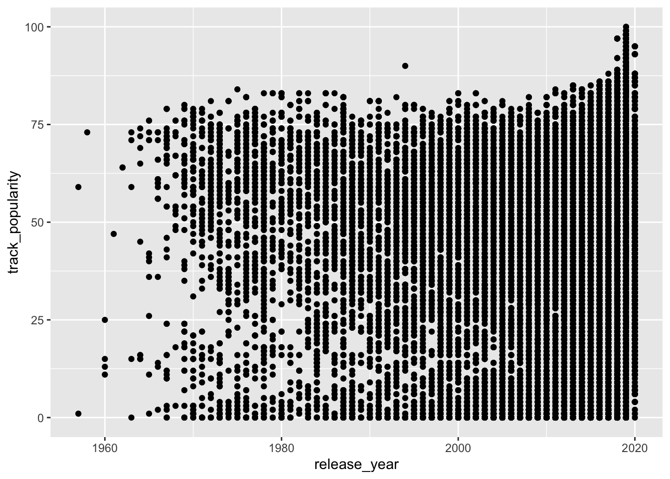
The variable track_popularity is continuous.
## `stat_bin()` using `bins = 30`. Pick better value with `binwidth`.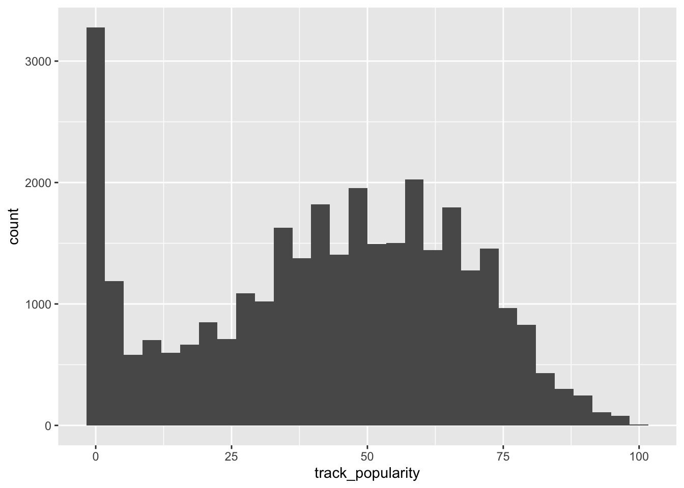
The variable release_year is also continuous.
## `stat_bin()` using `bins = 30`. Pick better value with `binwidth`.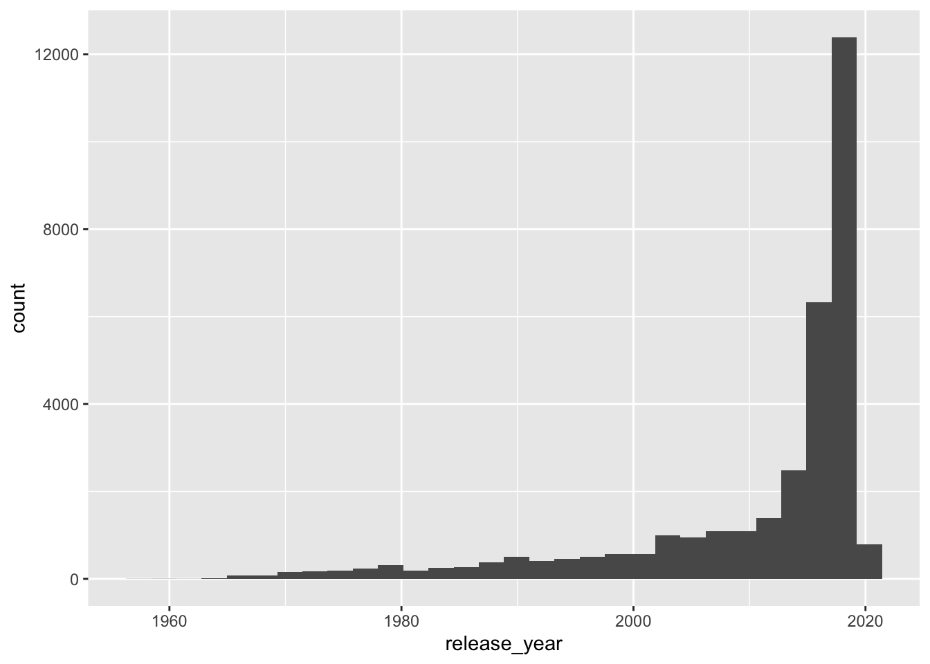
8.5 geom_ (i.e., Geometric Objects)
Functions such as geom_histogram(), geom_point(), and geom_col() are geometric objects and determine what type of plot R draws.
You can also map other elements of your chart in addition to position (i.e., x and y), such as color, size, and shape.
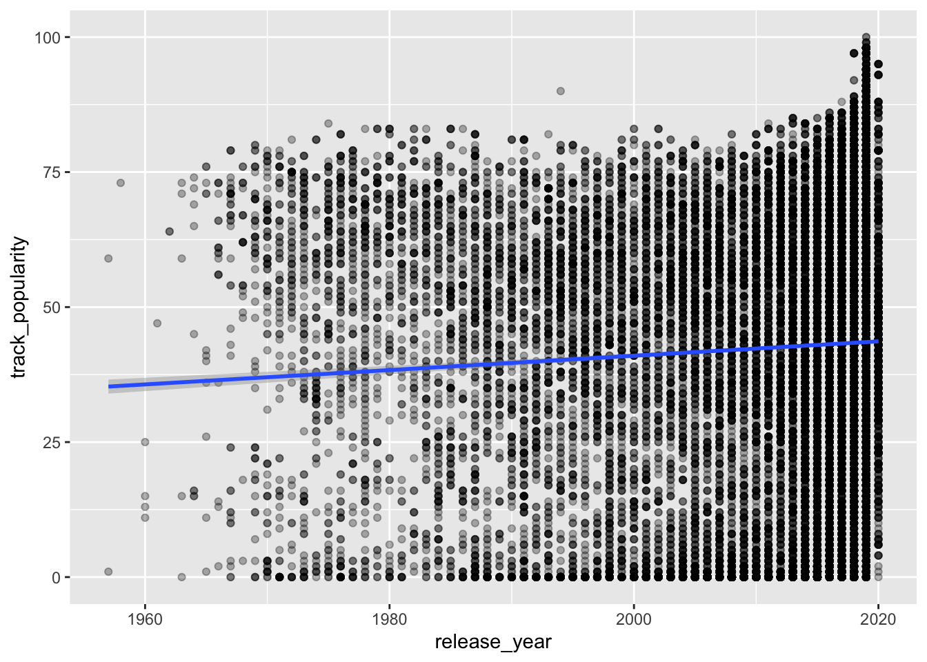
spotify_songs %>%
  ggplot(aes(x = release_year,
             y = track_popularity,
             color = playlist_genre)) +
geom_point() 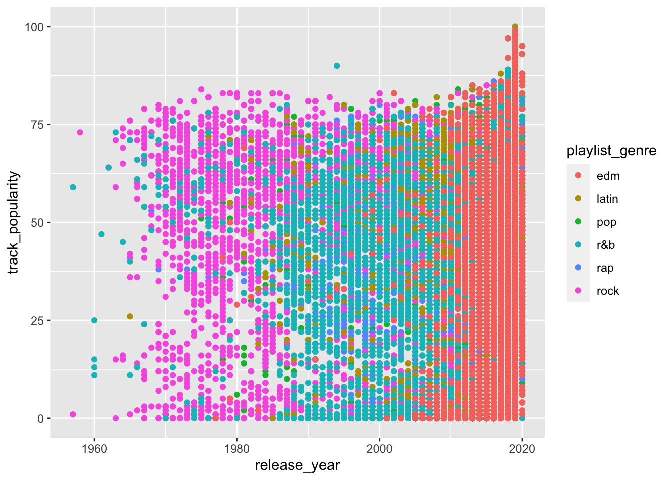
EXERCISE
Check the help page for geom_point (enter ?geom_point in your console).
Change geom_point() to the suggested variations in its help page.
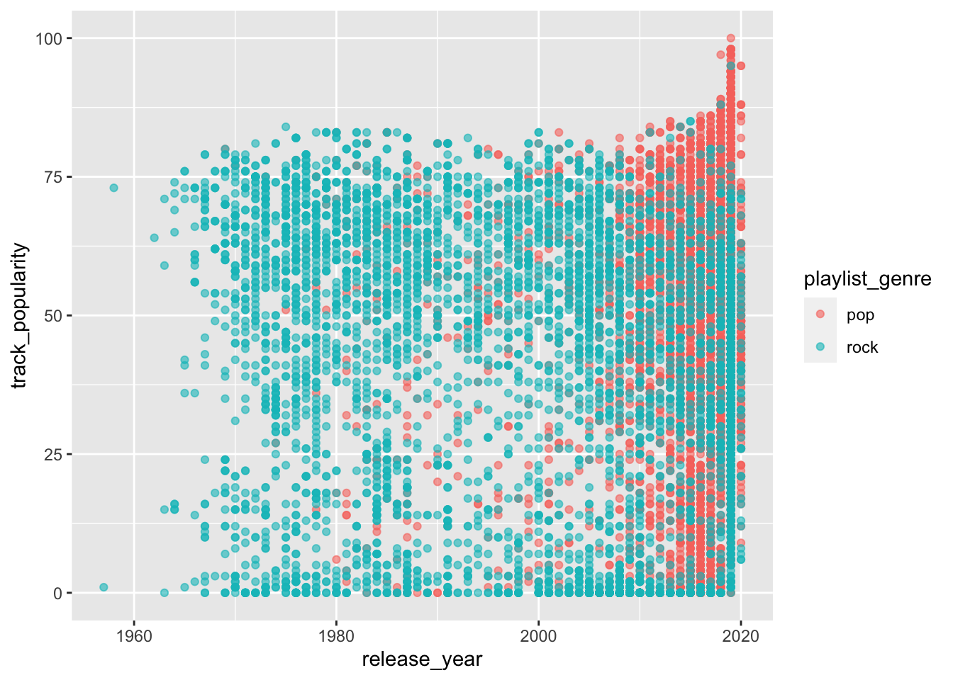
8.6 More mappings with aes()
In addition to color you can also add size and shape to aes().
spotify_songs %>%
  ggplot(aes(x = release_year,
             y = track_popularity,
             color = playlist_subgenre,
             shape = playlist_genre)) +
geom_point() 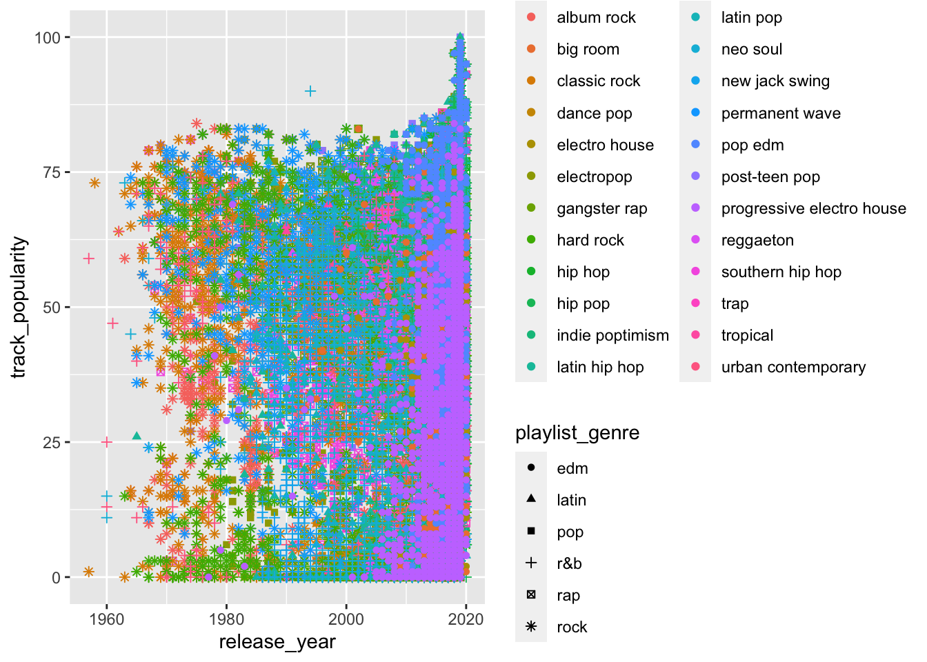
The plot above is too messy, there’s too much information. You often need to transform your data before plotting it.
EXERCISE
Summarize mean track_popularity by release_year, playlist_genre and playlist_subgenre.
Your summarized data frame should look something like this:
## `summarise()` has grouped output by 'release_year', 'playlist_genre'. You can override using the `.groups` argument.## # A tibble: 883 x 4
## # Groups: release_year, playlist_genre [302]
## release_year playlist_genre playlist_subgenre mean_popularity
## <dbl> <chr> <chr> <dbl>
## 1 1957 r&b urban contemporary 59
## 2 1957 rock classic rock 1
## 3 1958 rock classic rock 73
## 4 1960 r&b neo soul 13
## 5 1960 r&b urban contemporary 19
## 6 1961 r&b urban contemporary 47
## 7 1962 r&b urban contemporary 64
## 8 1962 rock classic rock 64
## 9 1963 r&b neo soul 73
## 10 1963 rock album rock 59
## # … with 873 more rowsNow you can plot your summarized data.
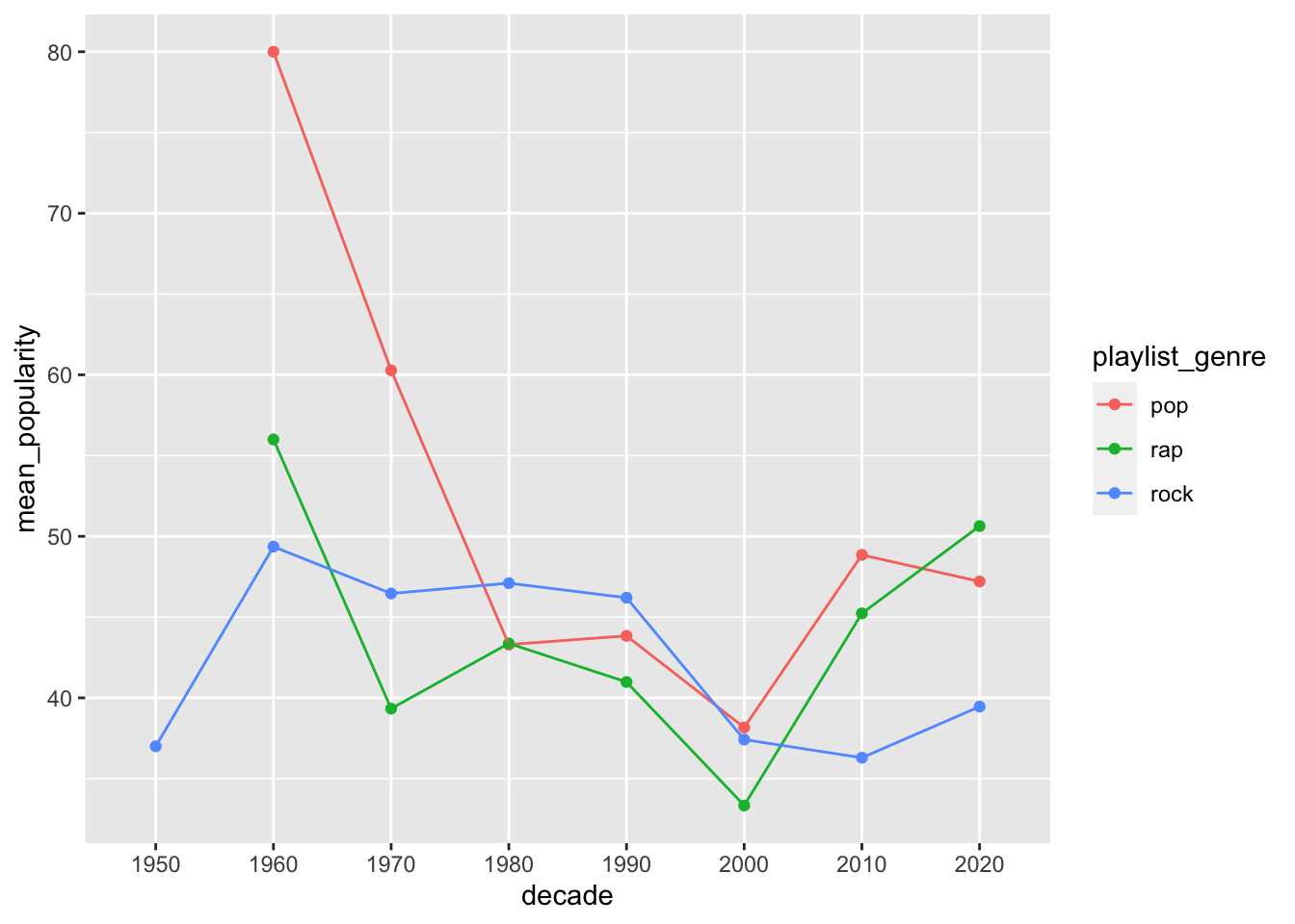
spotify_summary %>%
  ggplot(aes(x = release_year,
             y = mean_popularity,
             color = playlist_subgenre,
             shape = playlist_genre)) +
geom_point() 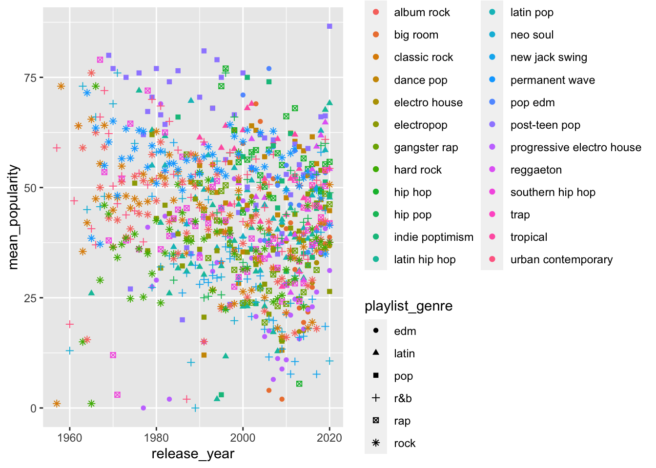
Still super messy. Shape is not really a good way to do this.
Let’s try a bar plot.
spotify_summary %>%
  ggplot(aes(x = release_year,
             y = mean_popularity,
             fill = playlist_genre)) +
geom_col(position = "dodge") 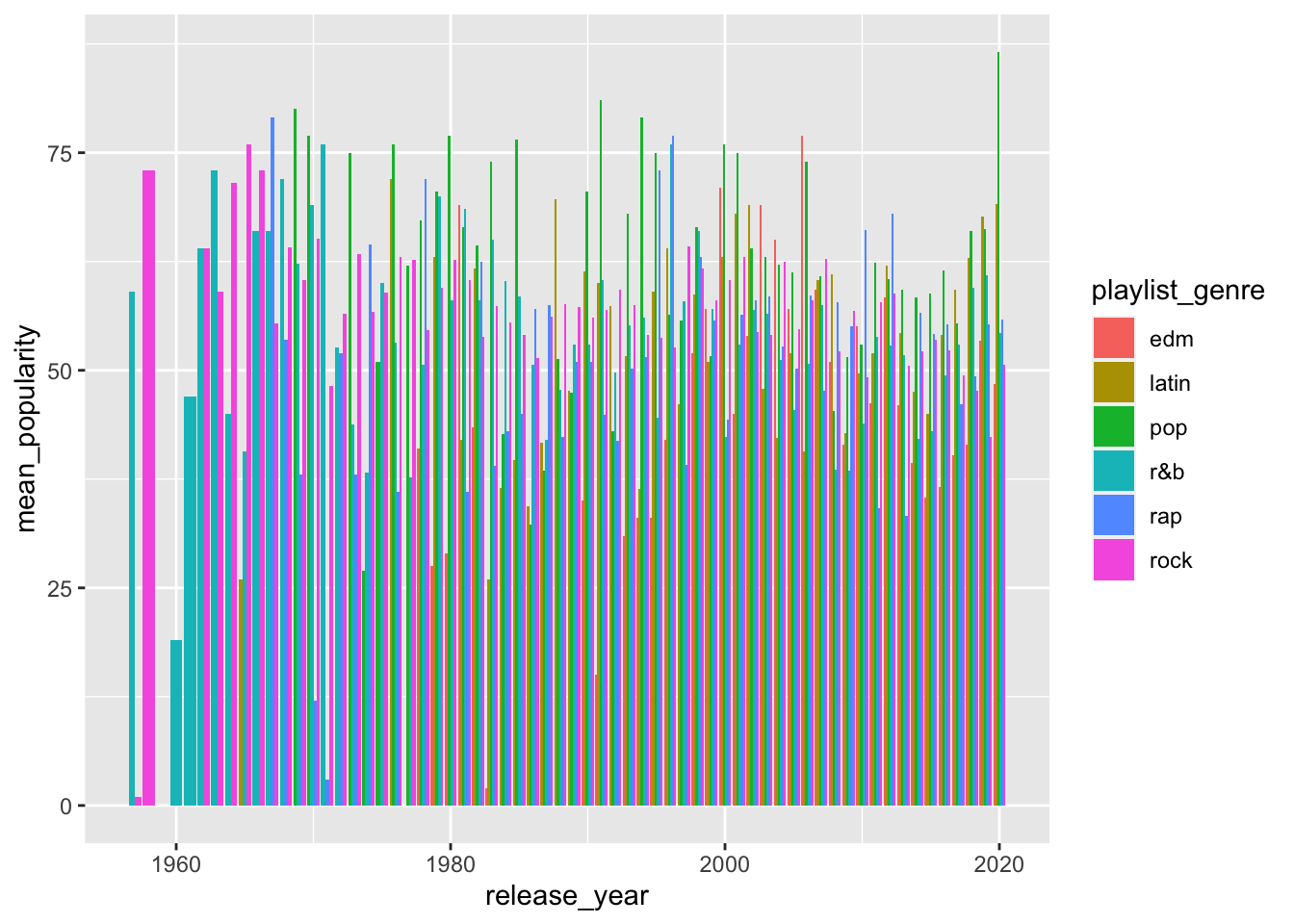
Not great either, too much going on.
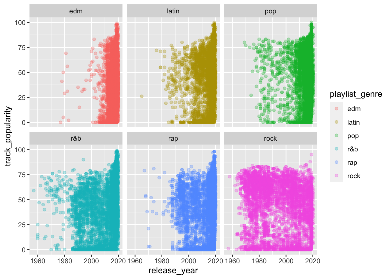
8.7 Facets
You can use the facet_wrap() function to split your plotting into several smaller plots, usually by a categorical variable.
Let’s try the scatterplot first.
spotify_summary %>%
  ggplot(aes(x = release_year,
             y = mean_popularity,
             color = playlist_genre)) +
  geom_point() +
  facet_wrap(~playlist_subgenre)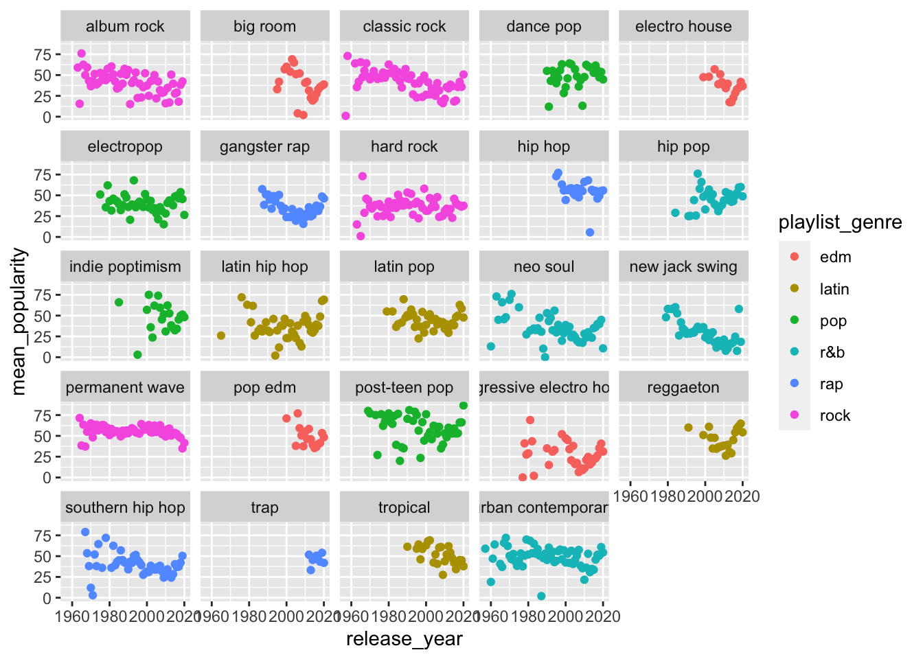
What about a bar plot?
spotify_summary %>%
  ggplot(aes(x = release_year,
             y = mean_popularity,
             fill = playlist_genre)) +
  geom_col(position = "dodge") +
  facet_wrap(~playlist_subgenre)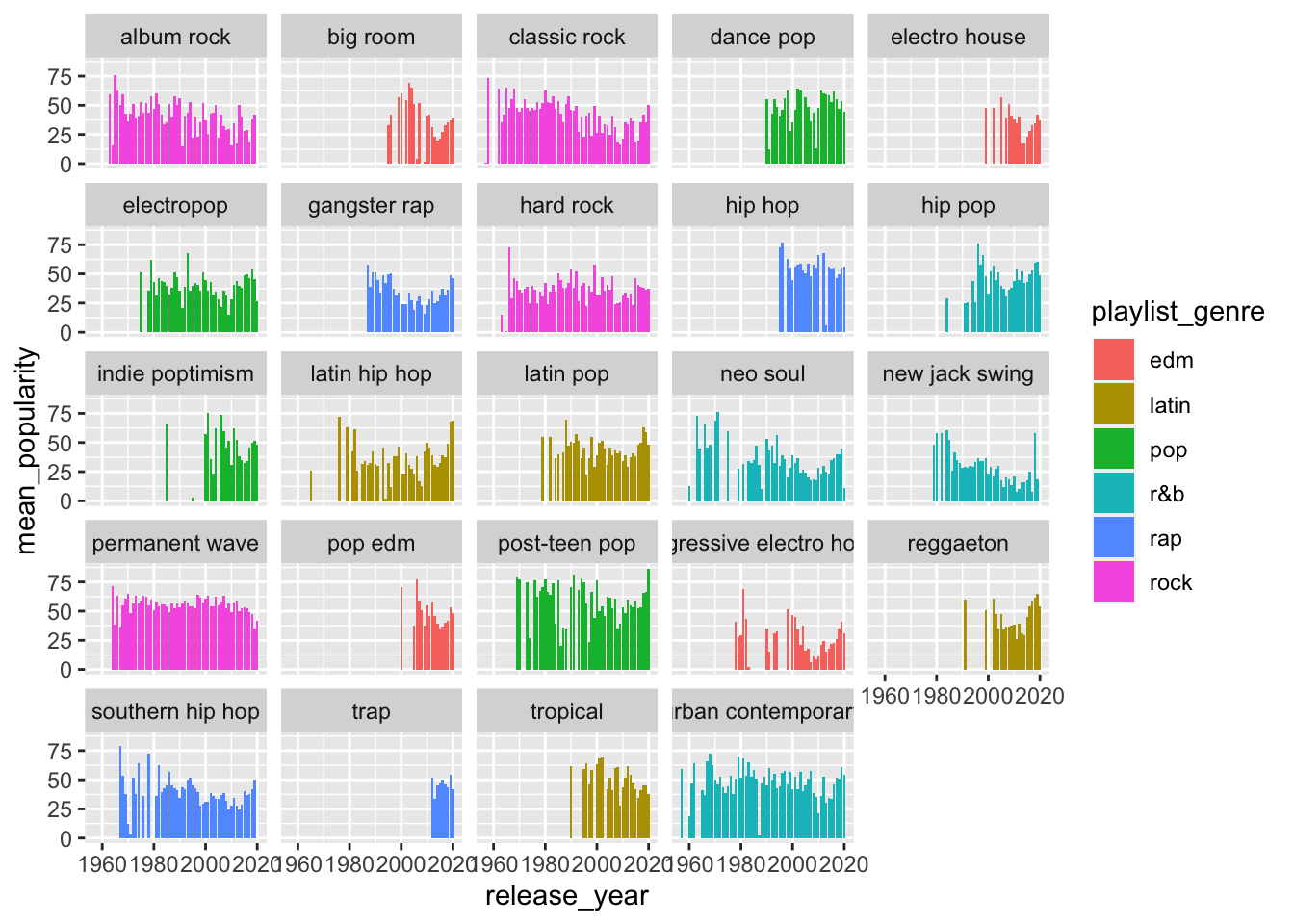
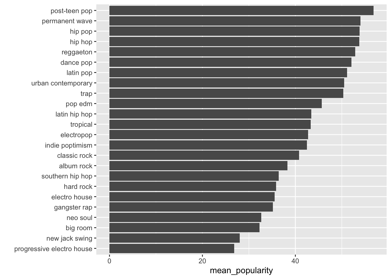
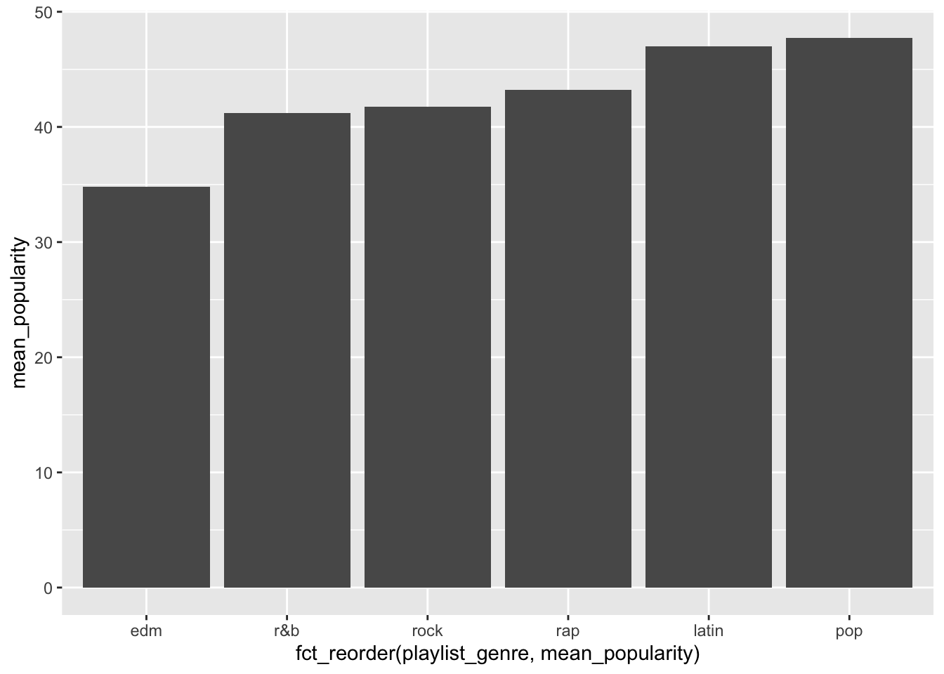
8.8 More Summarize
We can also plot categorical variables on the x axis.
EXERCISE
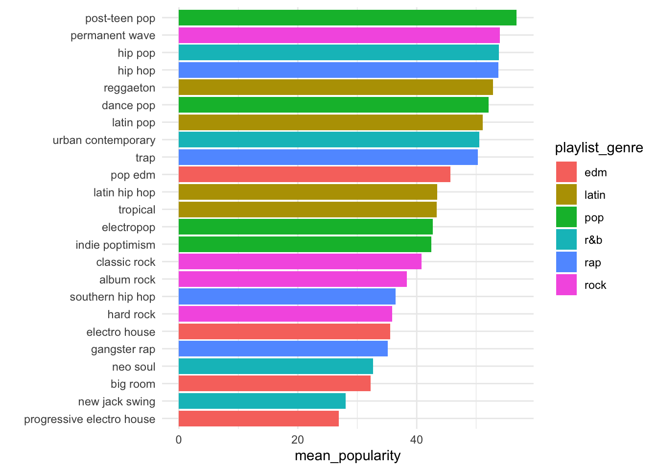
Summarize mean track_popularity by playlist_genre.
Your summarized data frame should look something like this:
## # A tibble: 6 x 2
##   playlist_genre mean_popularity
##   <chr>                    <dbl>
## 1 edm                       34.8
## 2 latin                     47.0
## 3 pop                       47.7
## 4 r&b                       41.2
## 5 rap                       43.2
## 6 rock                      41.7
Now plot a bar chart mapping x to playlist_genre, y to mean_popularity.
Your plot should look something like this:
8.9 DATA CHALLENGE 03
Accept data challenge 03 assignment