Mappings

Mappings

Visualization mapping links variables in the data to things you can see in your plot.

If you have not done so already, download the penguin and set up your analysis environment:

library(tidyverse)
penguins <- read_csv("data/penguins.csv")

We have a total of 8 variables. Take a moment to read whether each variable is a categorical or a numeric variable.

Axes (y and x)

  • In general we always start with mapping which variable will be plotted onto x and y (our axes)
  • Some plot types require you specify just an x, like histograms, because the y axis information is calculated by the histogram function itself
  • For plots in which you need to specify both axes, you normally have at least one of the axes mapped to a numeric variable

Question

What is the relationship between bill length and bill depth?

  • Two continuous numeric variables
  • Hypothesis: there is a positive relationship between bill length and bill depth
  • As bill length increases so does bill depth

Note that these two variables are in the same unit of measure (i.e., length and depth are both given in mm or millimeters)

Plot

Map variables to the two axes: bill length to y and bill depth to x.

We start with our data, then we map our variables to our axes using the ggplot() and aes() (i.e., aesthetics) functions.

penguins %>%
  ggplot(aes(x = bill_depth_mm,
             y = bill_length_mm))

Plot

Let’s add the geometrics:

penguins %>%
  ggplot(aes(x = bill_depth_mm,
             y = bill_length_mm)) +
  geom_point()

Color or fill

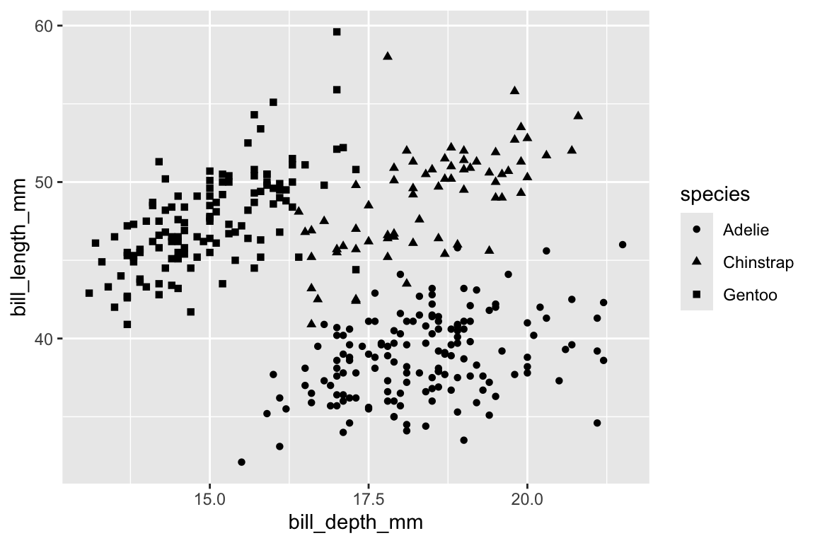
  • Mappings to axes are always required, so you need to decide what to map to x (and often also what to map to y) first. Then you build your other mappings.
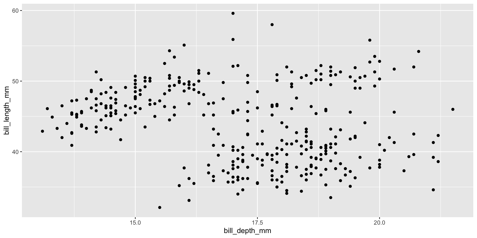
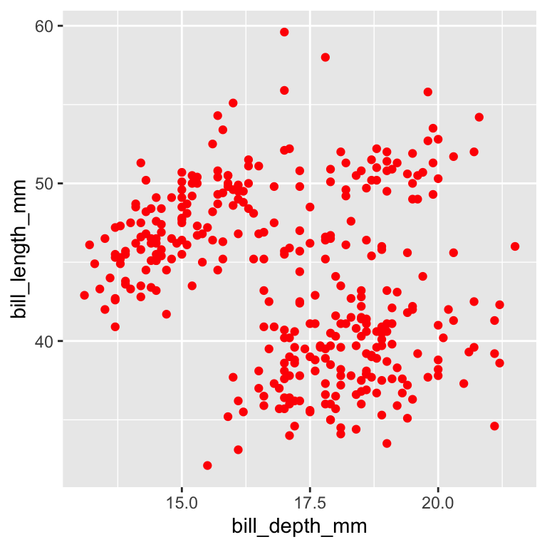
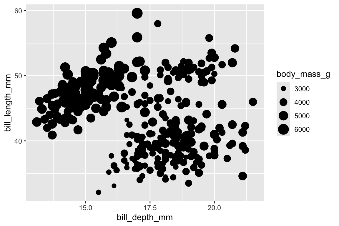
  • The scatter plot we generated seems to present clusters.
  • Data can cluster (i.e., form distinct groups) by a categorical variable.
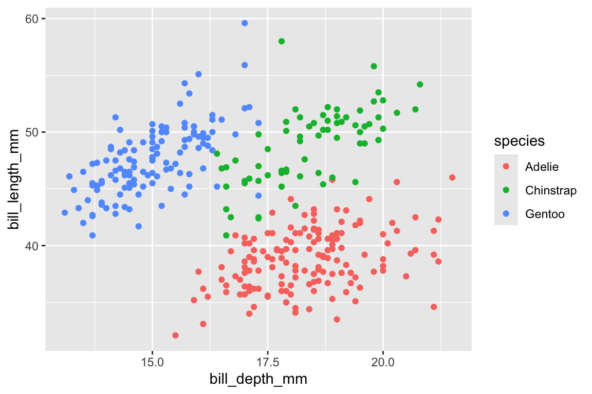
  • In our case, the most obvious categorical variable that would represent cluster is species.

Color or fill

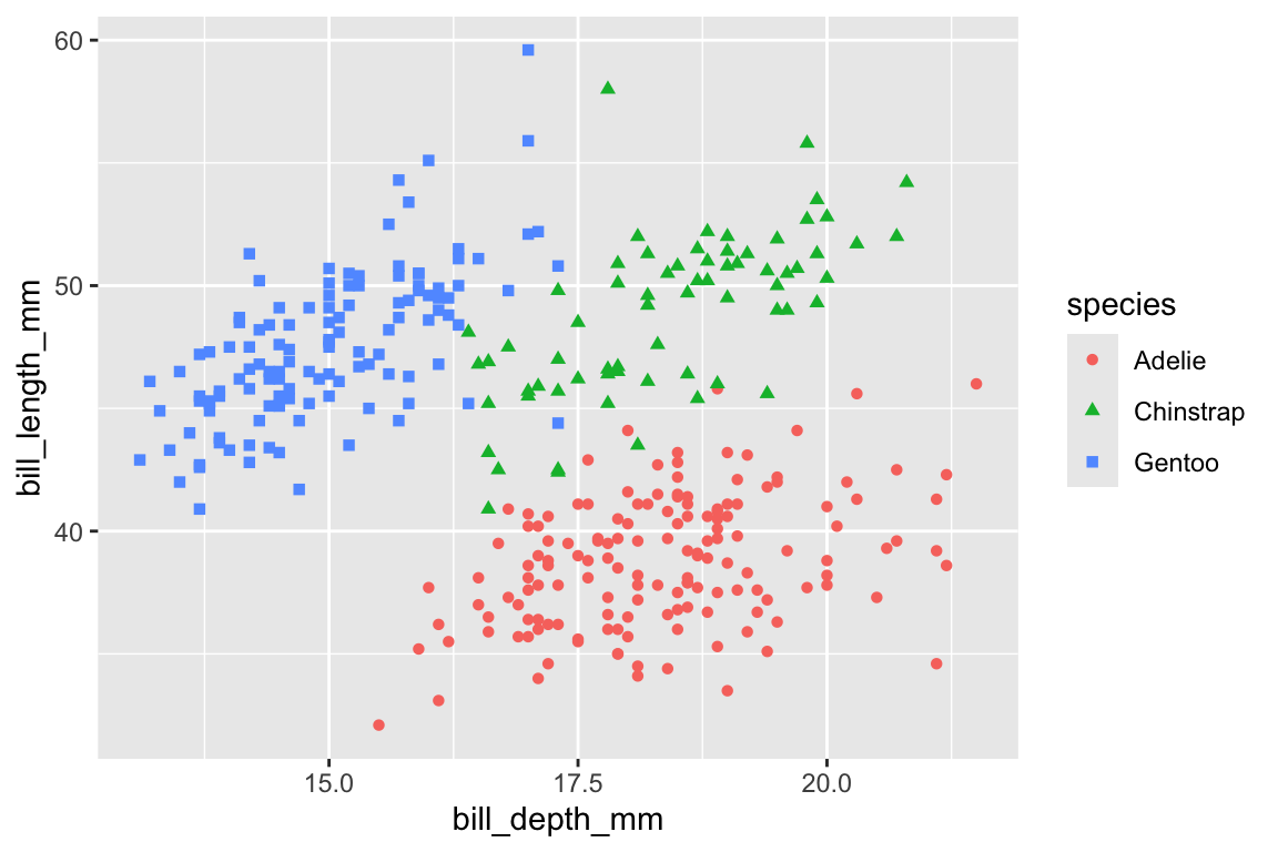
For geom_point the mapping we need is color. Let’s add that to our aesthetics mapping (i.e., inside the aes() function, which in turn is inside the ggplot() function).

penguins %>%
  ggplot(aes(x = bill_depth_mm,
             y = bill_length_mm,
             color = species)) +
  geom_point()

Color or fill

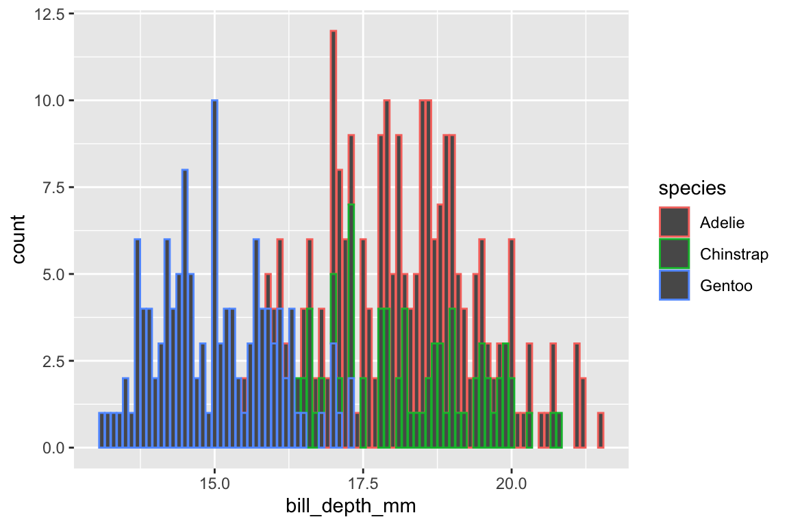
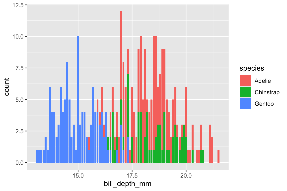
Let’s see how fill would be used. For that, we need a different type of plot, such as a bar plot. We can use geom_bar() with only x mapped to bill_depth_mm (the values for y are calculate by the geom_bar() function, and the default stat is count). We will also keep the mapping of species to color.

penguins %>%
  ggplot(aes(x = bill_depth_mm,
             color = species)) +
  geom_bar()

Color or fill

The mapping color in a bar plot determines the outline color of each bar. To map to the fill color of the bars, you need to use the fill mapping.

penguins %>%
  ggplot(aes(x = bill_depth_mm,
             fill = species)) +
  geom_bar()

Mapping vs. setting

You can always set a fixed color using the color parameter in the geometrics (e.g., inside geom_point()) by not using the aes() function and naming a specific color. Let’s change the color of the dots in our first scatterplot:

penguins %>%
  ggplot(aes(x = bill_depth_mm,
             y = bill_length_mm)) +
  geom_point(color = "red")

Size and shape

  • use size for numeric variable mappings
  • use shape for categorical variable mappings

Size and shape

Here’s the same scatter plot but with only shape mapped to the categorical variable species.

penguins %>%
  ggplot(aes(x = bill_depth_mm,
             y = bill_length_mm,
             shape = species)) +
  geom_point()

Size and color

Let’s now map shape and color to the categorical variable species.

penguins %>%
  ggplot(aes(x = bill_depth_mm,
             y = bill_length_mm,
             shape = species,
             color = species)) +
  geom_point()

Size and color

  • size is better mapped to numeric continuous variables, as opposed to categorical variables

Let’s map size to body_mass_g (i.e., penguin body mass in grams).

penguins %>%
  ggplot(aes(x = bill_depth_mm,
             y = bill_length_mm,
             size = body_mass_g)) +
  geom_point()

Reflection

  1. Which scatter plot is clearer? Why?

Remember that some channels are better processed than others, with color being one of the best channels in terms of visual processing.