What makes a great visualization
What makes a great visualization?
- honest information in a beautiful manner
- easy to read and interpret
A great visualization is the result of:
Honesty + Good Judgment
Honesty + Good Judgment
In the following sections, these two elements are broken down further. Most of this material is summarized from Kieran Healy’s book “Data Visualization: A Practical Introduction” (Healy, 2018), Chapter 1.
Good aesthetics
Good aesthetics (as opposed to bad taste) is hard to operationalize,
Some general guidelines (that might be broken at times):
- Maximize data-to-ink ratio
- Clean up typefaces (the fewer different typefaces, the better)
- Avoid extraneous colors and backgrounds
- Simplify, mute, or delete gridlines
- Remove superfluous axis marks and labels
- Avoid excessive decorative embellishments
Good aesthetics
You want to ensure that your visualizations are:
- beautiful
- easy to read and interpret
- memorable (i.e., visually distinctive)
These goals might conflict with each other at times and only practice will tell you how to balance all of these elements.
No substantive issues
Here are two main general issues to avoid:
- Bad data: ensure you are working with good quality data, and do your homework in terms of data checking and transforming (this process often takes a lot of time, but it is essential)
What to avoid: Tricky scales
- By simply choosing a line plot versus a bar plot, you scale for your axis might change, changing the perception of how big or small differences across years or groups are
- When providing comparisons, make sure you are as transparent about your scales as possible
- The easiest way is to be honest is to keep the same scale across different panels and/or plots and keep the full scale of the original data
- If you are displaying percentages on the y scale, make sure your limits for the y axis are set for 0% to 100%
What to avoid – Perceptual issues
- Visualizations rely on our visual system and how we perceive geometric shapes and relationships
- Some plots/visualizations are more difficult to interpret than others
- Due to human perception, 3D plots are often harder to read and interpret differences between bars, for example
- Stacked bars make general trends easier to read, but differences between subcategories are harder to interpret.
Bad and Good examples
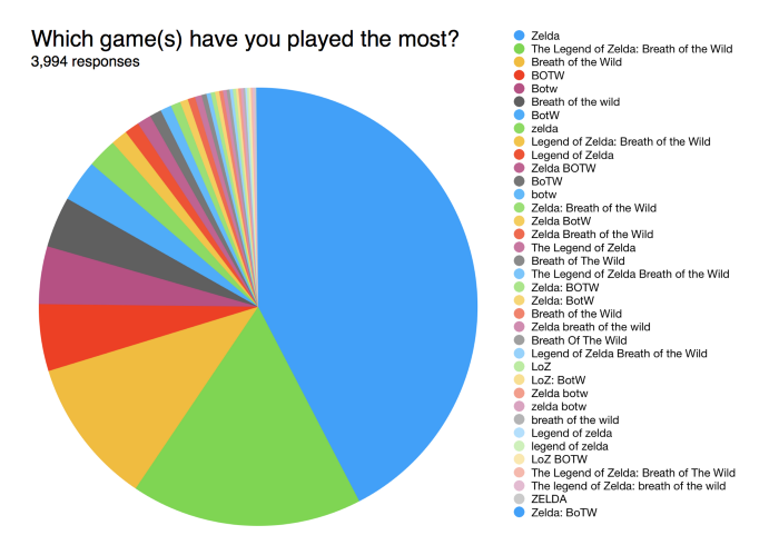
Pie chart
Discuss with a partner: What principles does this violate?
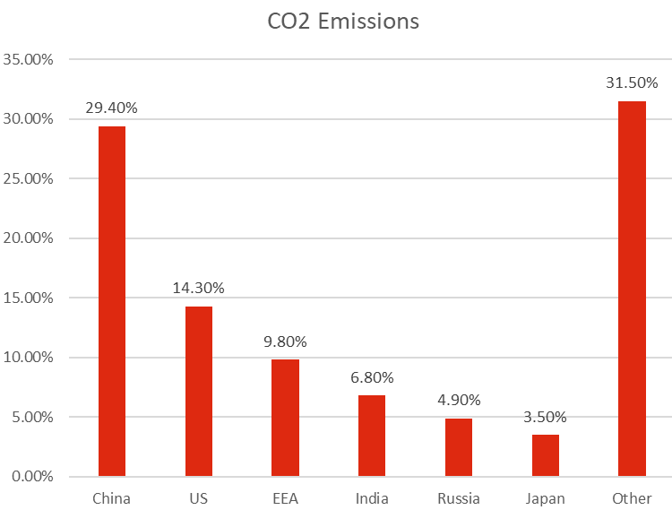
Bar? chart
Discuss with a partner: What principles does this violate?
Bar chart
Discuss with a partner: What principles is this respecting?
REFERENCE
Healy, K. (2018). Data visualization: a practical introduction. Princeton University Press.