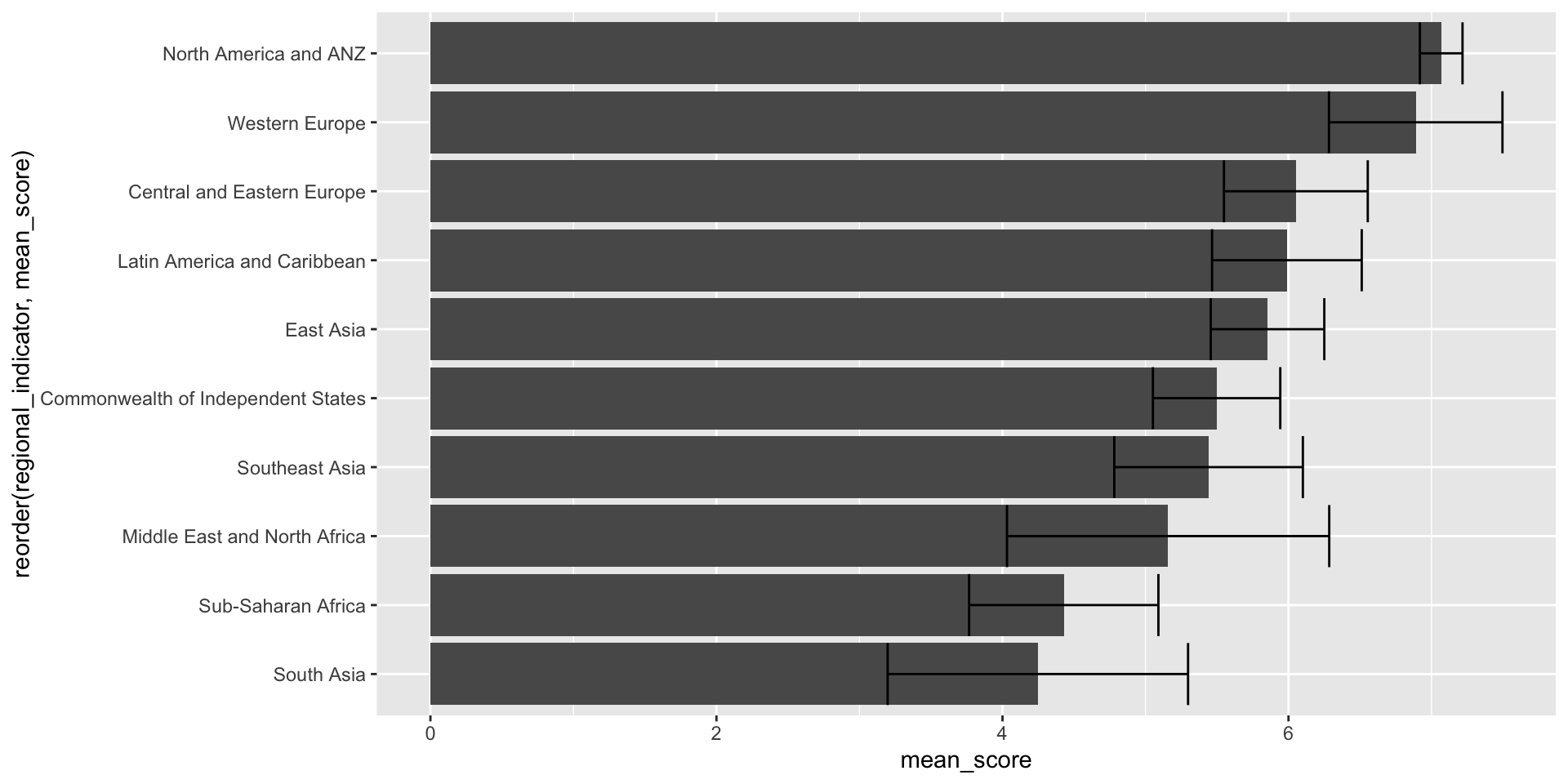
Case Study

Data

We will be using data from the World Happiness Report for this case study.

Download the data and set it up in your working environment.

library(tidyverse)

happiness <- read_csv("data/world-happiness-2020-2024.csv")

Questions

What questions can you ask based on the data?

Distribution

happiness |>
  ggplot(aes(x = ladder_score)) +
  geom_histogram() 

Distribution

happiness |>
  ggplot(aes(x = ladder_score)) +
  geom_histogram() +
  facet_wrap(~regional_indicator)

Measures of centrality and variability

happiness |>
  group_by(regional_indicator) |>
  summarize(mean_score = mean(ladder_score),
            sd_score = sd(ladder_score))
regional_indicator mean_score sd_score
Central and Eastern Europe 6.051499 0.5028462
Commonwealth of Independent States 5.497196 0.4452581
East Asia 5.853280 0.3971070
Latin America and Caribbean 5.988879 0.5232964
Middle East and North Africa 5.158222 1.1266599
North America and ANZ 7.067760 0.1491133
South Asia 4.247478 1.0502632
Southeast Asia 5.441158 0.6593355
Sub-Saharan Africa 4.428523 0.6617718
Western Europe 6.889537 0.6066269

Bar plot

happiness |>
  group_by(regional_indicator) |>
  summarize(mean_score = mean(ladder_score),
            sd_score = sd(ladder_score)) |>
  ggplot(aes(x = mean_score, 
             y = reorder(regional_indicator, mean_score))) +
  geom_col() +
  geom_errorbar(aes(xmin = mean_score-sd_score, xmax = mean_score+sd_score))

Line plot

happiness |>
  group_by(regional_indicator, year) |>
  summarize(mean_score = mean(ladder_score)) |>
  ggplot(aes(x = year, y = mean_score, color = regional_indicator)) + 
  geom_point() +
  geom_line()

Box plot

happiness |>
  ggplot(aes(y = reorder(regional_indicator, ladder_score), 
             x = ladder_score)) +
  geom_boxplot() +
  labs(title = "IQR of happiness scores across regions",
       y = "")