Counting Categorical Data
Counting variables
We can use the count() function to count how many of each value (level) we have in a categorical variable.
survey |>
  count(eye_color)
Contingency Tables
When we count how many observations across two categorical variables, we are creating a cross-tab, cross-tabulation, or a contingency table.
- table that displays the frequency distribution of multiple variables
- shows how two or more categorical variables relate to each other
- commonly used in statistics for analyzing relationships between categorical data
Contingency Tables
survey |>
  count(personality, eye_color)
Contingency Tables
survey |>
  count(personality, eye_color) |>
  pivot_wider(names_from = personality, values_from = n)
Each cell shows the count (frequency) of individuals that fall into both categories.
Contingency Tables
From contingency tables, we can:
- Calculate proportions and percentages
- Perform statistical tests like chi-square tests to determine if there’s a significant relationship between variables
- Identify patterns or trends in categorical data
- Compute measures of association
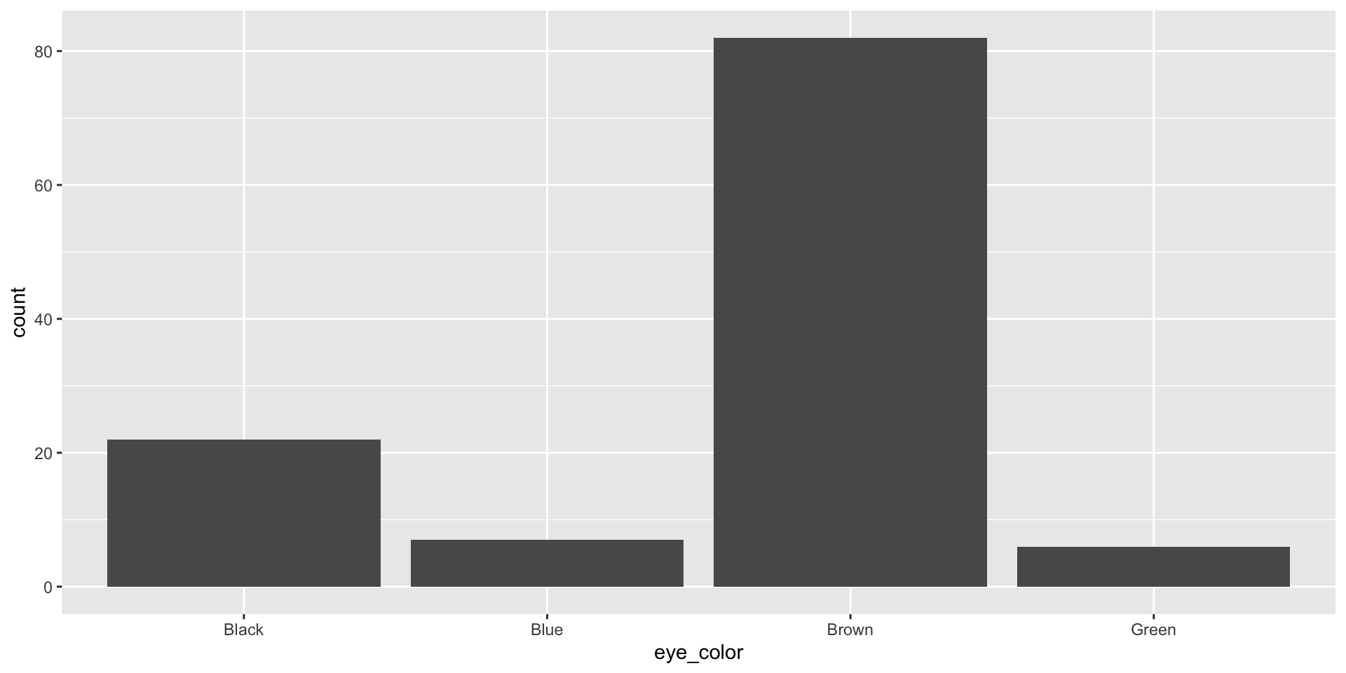
Bar plot
A bar plot is a common way to display a single categorical variable.
survey |>
  ggplot(aes(x = eye_color)) +
  geom_bar()
![]()
Proportions
We can combine group_by(), summarize(), and mutate() to get proportions
survey |>
  group_by(eye_color) |>
  summarize(n = n()) |>
  mutate(total = sum(n),
         percent = n/total)
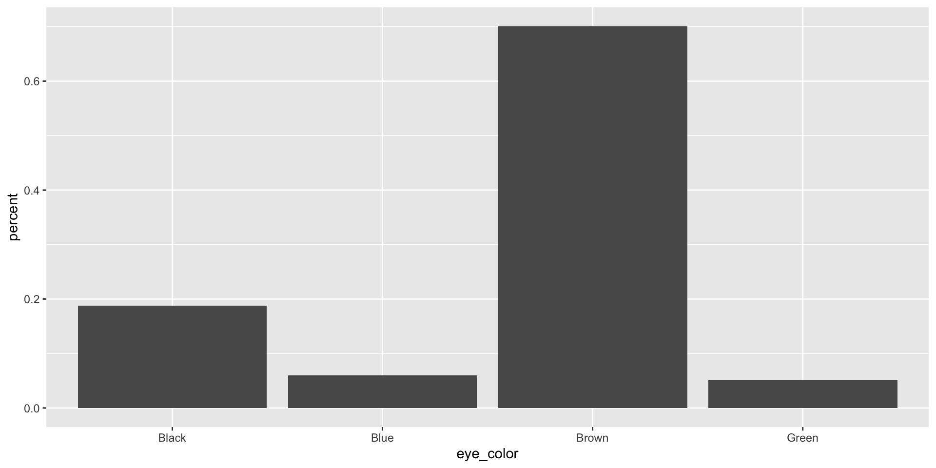
Relative Frequency Bar Plot
A bar plot where proportions instead of frequencies are shown is called a relative frequency bar plot.
survey |>
  group_by(eye_color) |>
  summarize(n = n()) |>
  mutate(total = sum(n),
         percent = n/total) |>
  ggplot(aes(x = eye_color, y = percent)) +
  geom_col()
![]()
How are bar plots different than histograms?
- Bar plots are used for displaying distributions of categorical variables, while histograms are used for numerical variables.
- The x-axis in a histogram is a number line, hence the order of the bars cannot be changed
- In a bar plot the categories can be listed in any order (though some orderings make more sense than others, especially for ordinal variables)
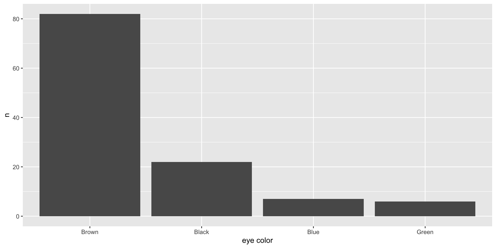
Ordering a bar plot
survey |>
  group_by(eye_color) |>
  summarize(n = n()) |>
  ggplot(aes(x = reorder(eye_color, -n), y = n)) +
  geom_col() +
  labs(x = "eye color")
![]()
Proportions in contingency tables
What is the personality split for each eye color?
survey |>
  group_by(eye_color, personality) |>
  summarize(n = n()) |>
  mutate(total = sum(n),
         percent = n/total)
Proportions in contingency tables
What’s the eye color proportion for each personality?
survey |>
  group_by(personality, eye_color) |>
  summarize(n = n()) |>
  mutate(total = sum(n),
         percent = n/total)
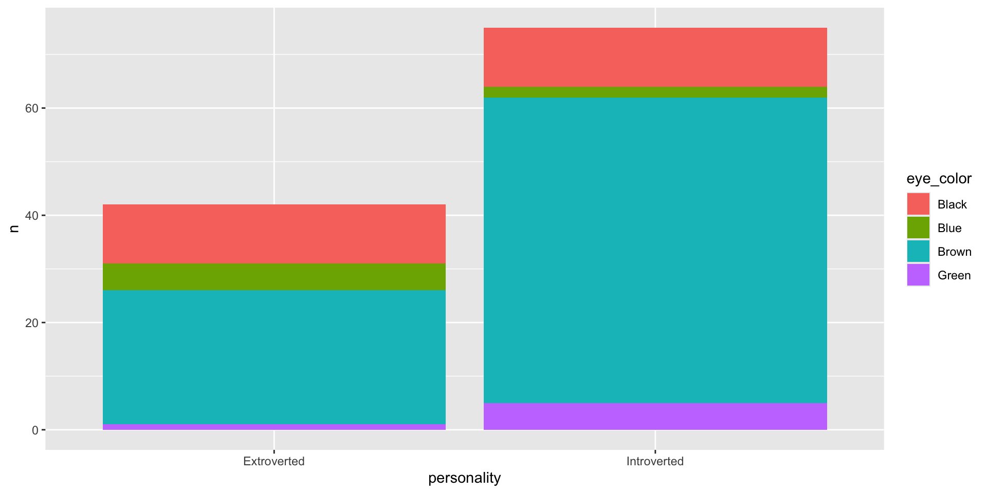
Bar plots with two variables
What’s the eye color proportion for each personality?
survey |>
  group_by(personality, eye_color) |>
  summarize(n = n()) |>
  mutate(total = sum(n),
         percent = n/total) |>
  ggplot(aes(x = personality, y = n, fill = eye_color)) +
  geom_col()
![]()
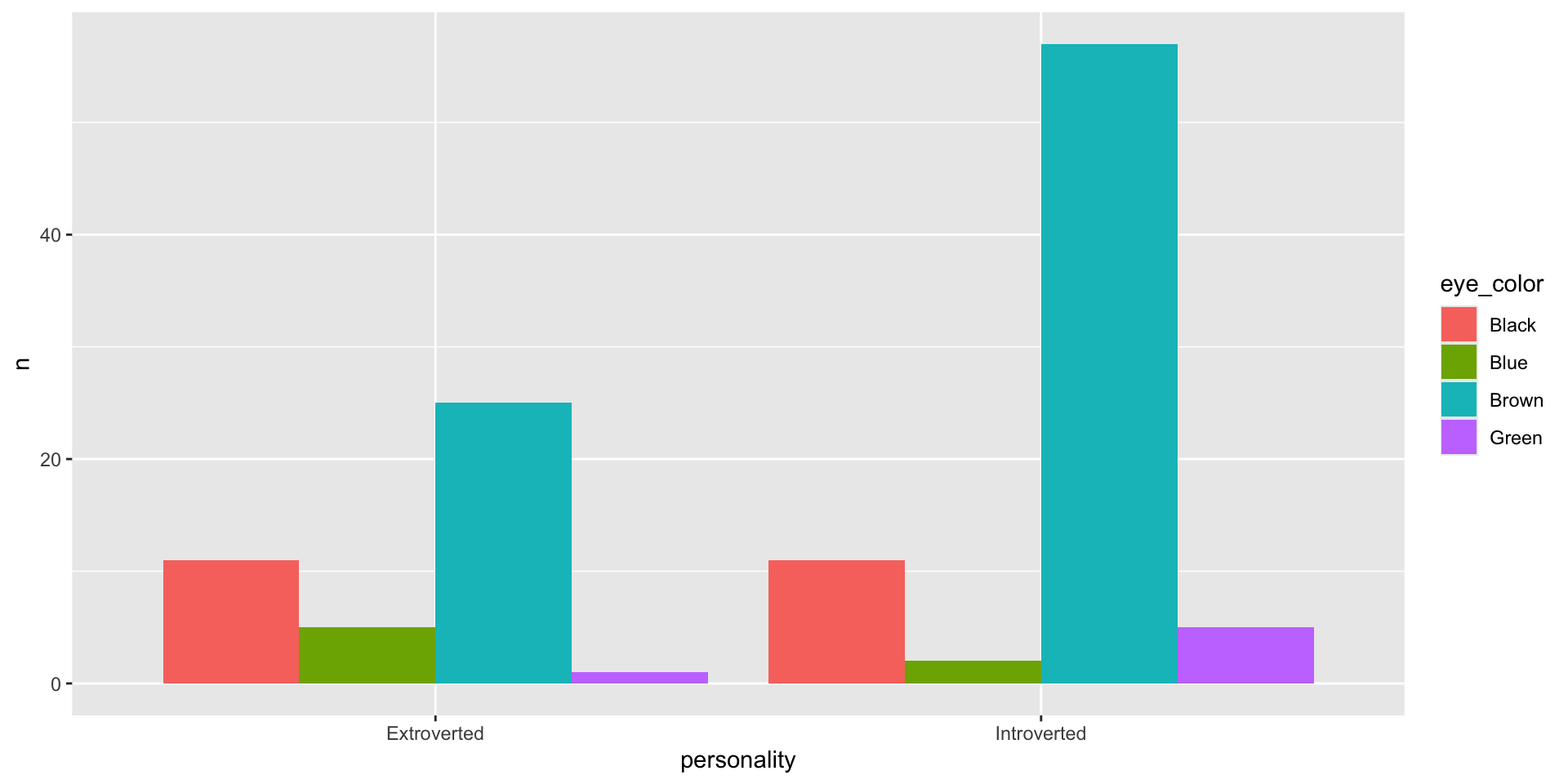
Bar plots with two variables
What’s the eye color proportion for each personality?
survey |>
  group_by(personality, eye_color) |>
  summarize(n = n()) |>
  mutate(total = sum(n),
         percent = n/total) |>
  ggplot(aes(x = personality, y = n, fill = eye_color)) +
  geom_col(position = "dodge")
![]()
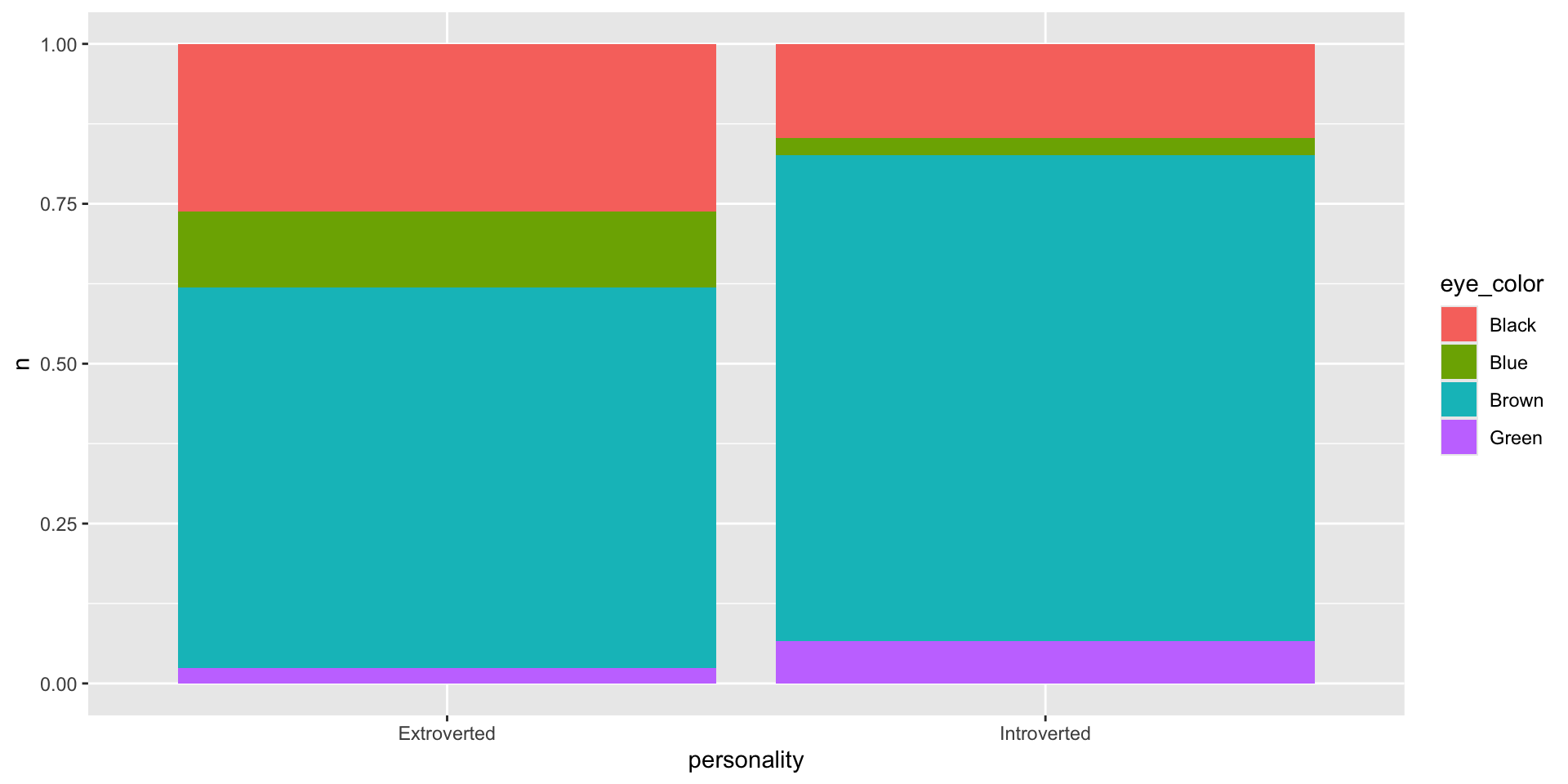
Bar plots with two variables
What’s the eye color proportion for each personality?
survey |>
  group_by(personality, eye_color) |>
  summarize(n = n()) |>
  mutate(total = sum(n),
         percent = n/total) |>
  ggplot(aes(x = personality, y = n, fill = eye_color)) +
  geom_col(position = "fill")
![]()
Practice
What other questions can you answer with this data?
- Create contingency tables
- Create bar plots based on your tables
Gradescope activity
Go to gradescope and click on summarizing data and answer the questions about the survey data we have been working on