Summarizing Data

The data

We will be working with global surface temperature (1940-2024)

First, download the data and set it into your project folder.

library(tidyverse)

temperatures <- read_csv("data/average-monthly-surface-temperature.csv")

Variables

  • country_name
  • country_code
  • year
  • day
  • daily_average
  • monthly_average

Inspect the data

temperatures |>
  glimpse()
Rows: 198,900
Columns: 6
$ country_name    <chr> "Afghanistan", "Afghanistan", "Afghanistan", "Afghanis…
$ country_code    <chr> "AFG", "AFG", "AFG", "AFG", "AFG", "AFG", "AFG", "AFG"…
$ year            <dbl> 1940, 1940, 1940, 1940, 1940, 1940, 1940, 1940, 1940, …
$ day             <date> 1940-01-15, 1940-02-15, 1940-03-15, 1940-04-15, 1940-…
$ daily_average   <dbl> -2.0324936, -0.7335030, 1.9991340, 10.1997540, 17.9421…
$ monthly_average <dbl> 11.32770, 11.32770, 11.32770, 11.32770, 11.32770, 11.3…

Inspect the data

temperatures |>
  summary()
 country_name       country_code            year           day            
 Length:198900      Length:198900      Min.   :1940   Min.   :1940-01-15  
 Class :character   Class :character   1st Qu.:1961   1st Qu.:1961-04-07  
 Mode  :character   Mode  :character   Median :1982   Median :1982-06-30  
                                       Mean   :1982   Mean   :1982-06-30  
                                       3rd Qu.:2003   3rd Qu.:2003-09-22  
                                       Max.   :2024   Max.   :2024-12-15  
 daily_average    monthly_average 
 Min.   :-36.24   Min.   :-21.53  
 1st Qu.: 12.30   1st Qu.: 10.57  
 Median : 22.06   Median : 21.86  
 Mean   : 18.07   Mean   : 18.07  
 3rd Qu.: 25.32   3rd Qu.: 25.14  
 Max.   : 39.89   Max.   : 29.79  

Questions

What questions would you be interested in answering, based on this data set?

Plots

temperatures |>
  ggplot(aes(x = daily_average)) +
  geom_histogram()

Plots

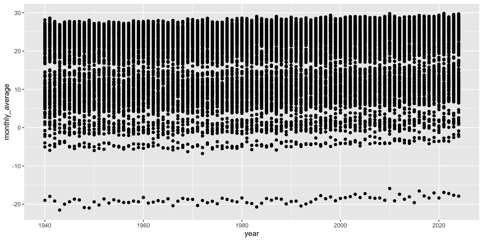
Too much data to visualize – we need to filter and/or summarize the data.

temperatures |>
  ggplot(aes(x = year, y = monthly_average)) +
  geom_point()

Descriptive Statistics

temperatures |>
  group_by(year) |>
  summarize(mean = mean(daily_average),
            median = median(daily_average),
            sd = sd(daily_average),
            min = min(daily_average),
            max = max(daily_average)) |>
  mutate(range = max - min,
         lower = mean - sd,
         upper = mean + sd)

Descriptive Statistics – save results

temp_desc <- temperatures |>
  group_by(year) |>
  summarize(mean = mean(daily_average),
            median = median(daily_average),
            sd = sd(daily_average),
            min = min(daily_average),
            max = max(daily_average)) |>
  mutate(range = max - min,
         lower = mean - sd,
         upper = mean + sd)

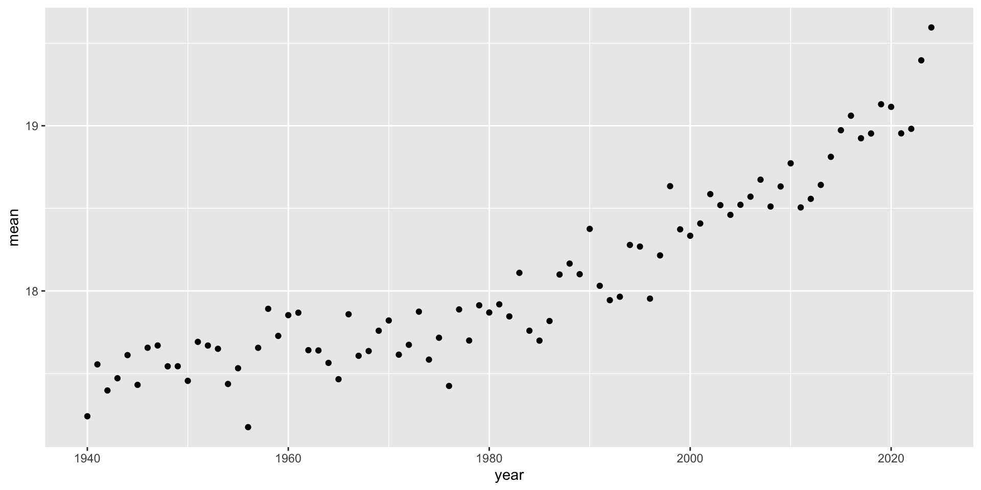
Visualizing Statistics

temp_desc |>
  ggplot(aes(x = year, y = mean)) +
  geom_point() 

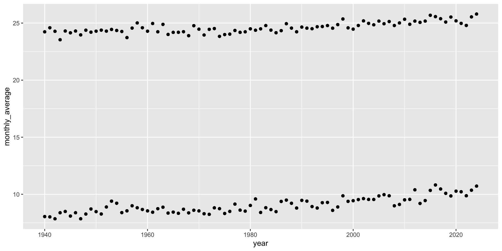
Filtering the data by country

temperatures |>
  filter(country_code == "USA") |>
  ggplot(aes(x = year, y = monthly_average)) +
  geom_point()

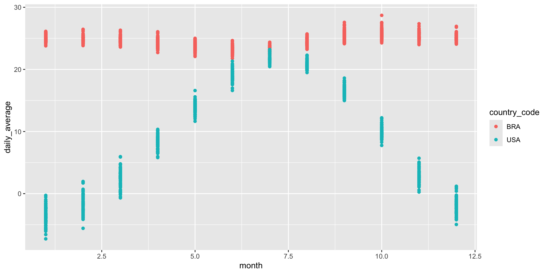
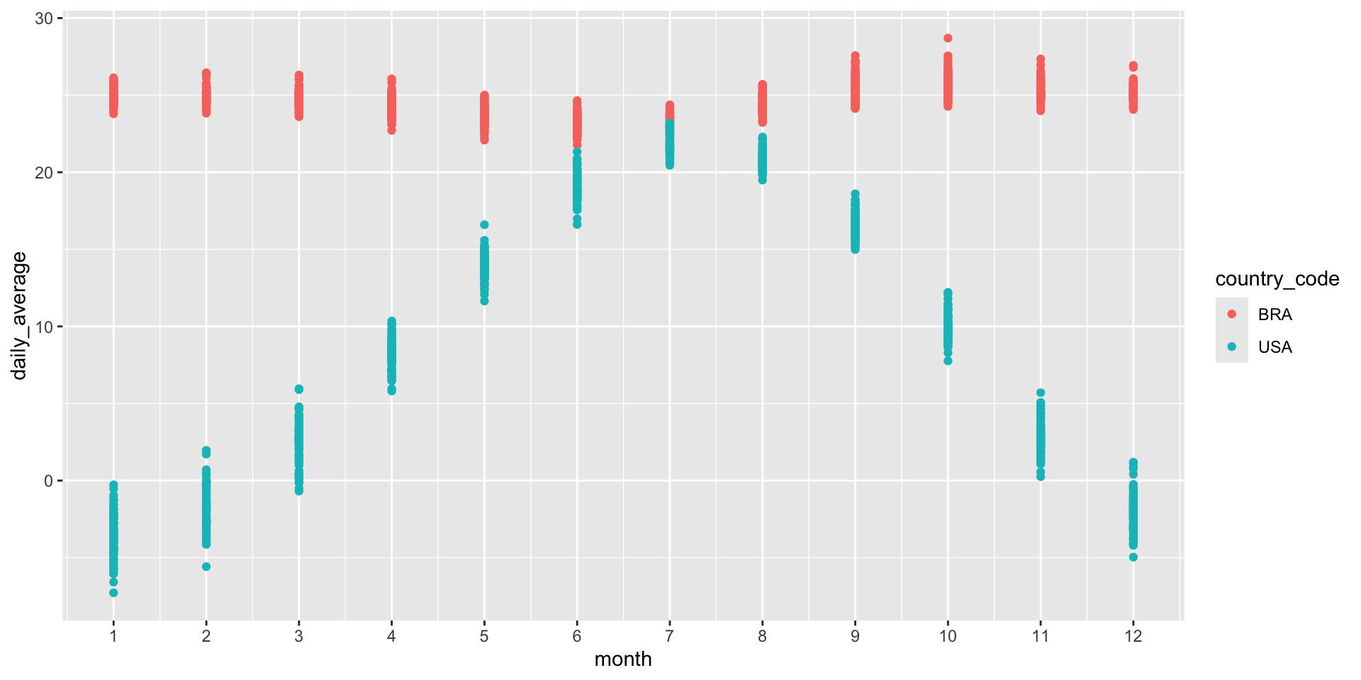
Filtering the data by countries
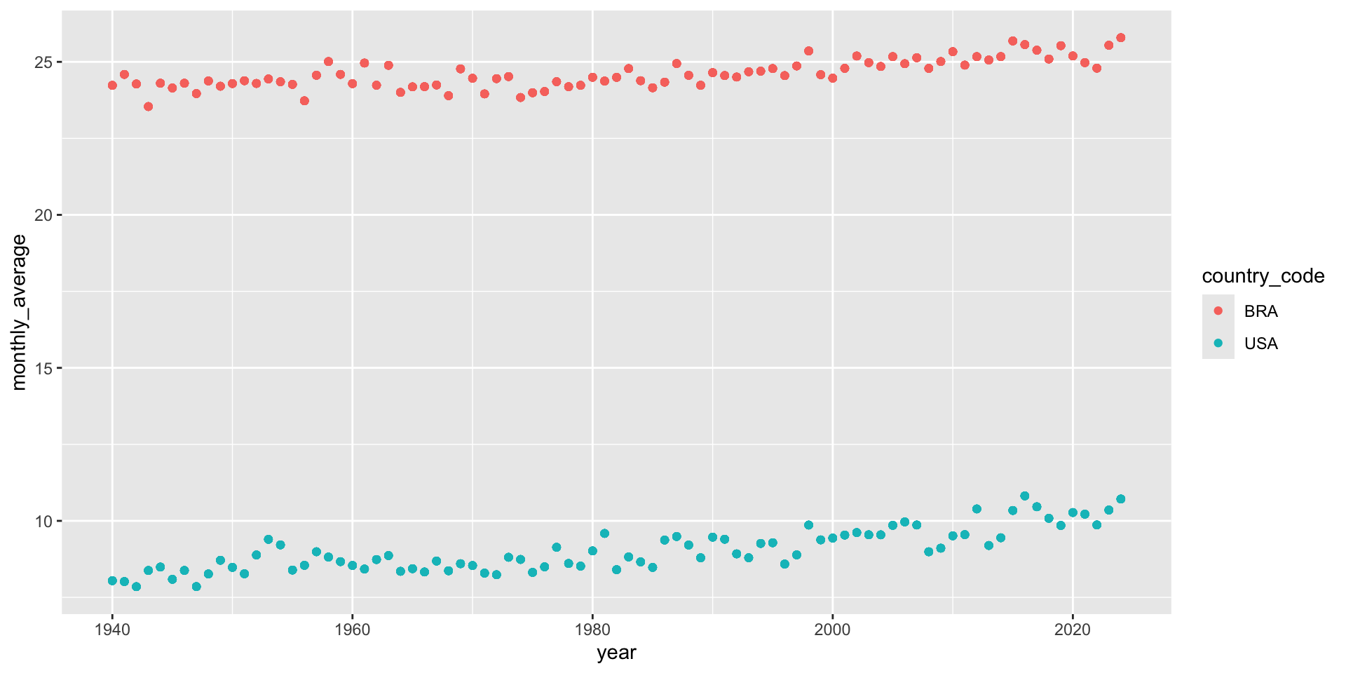
countries <- c("USA", "BRA")

temperatures |>
  filter(country_code %in% countries) |>
  ggplot(aes(x = year, y = monthly_average)) +
  geom_point()

Adding color

countries <- c("USA", "BRA")

temperatures |>
  filter(country_code %in% countries) |>
  ggplot(aes(x = year, y = monthly_average, color = country_code)) +
  geom_point()

Extracting month

temperatures |>
  mutate(month = month(day))

Extracting month – save to data frame

temperatures <- temperatures |>
  mutate(month = month(day))

Plot

temperatures |>
  filter(country_code %in% countries) |>
  ggplot(aes(x = month, y = daily_average, color = country_code)) +
  geom_point() 

Plot

temperatures |>
  filter(country_code %in% countries) |>
  ggplot(aes(x = month, y = daily_average, color = country_code)) +
  geom_point() +
  scale_x_continuous(breaks = c(1:12))