Descriptive Statistics
What is descriptive statistics?
- summarize a given data set
- measures of:
- distribution (how data is spread out and how frequently different values occur)
- central tendency (mean, median, mode)
- variability (range, standard deviation, variance, interquartile range – IQR)
The data
We will be using US demographic data for our exploratory analyses.
You can download the csv file and add it to your RStudio (or Posit Cloud) project.
Create a new R script file and save it as county-data-analysis.R and load the tidyverse package and the data.
Review of steps
Let’s practice what we have covered so far, which is the following:
- Summarize the data by calculating the mean of the numeric variables
- Create a scatter plot of two numeric variables
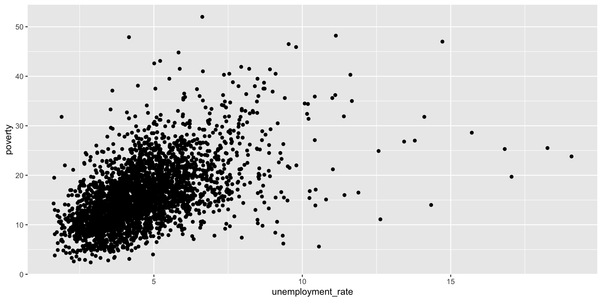
Scatterplot
Distribution
How data is spread out and how frequently different values occur.
Histogram: the frequency distribution of a continuous variable
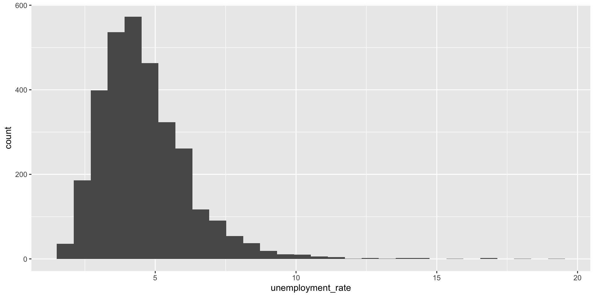
Histogram
- Provides a view of the data density
- Describes the sahpe of the data distribution
- Higher bars represent where what values are more common
Histogram
- x-axis shows the data ranges (bins)
- y-axis shows the frequency (count or percentage)
- bins: intervals the data range is divided into, each bin displays one bar
- the height of each bar shows how many data points fall within that bin
- the shape shows the distribution pattern (normal, skewed, bimodal, etc.)
- the width of the bins can be manipulated
Histogram
The defaul number of bins for geom_histogram() is 30, but we can change that.
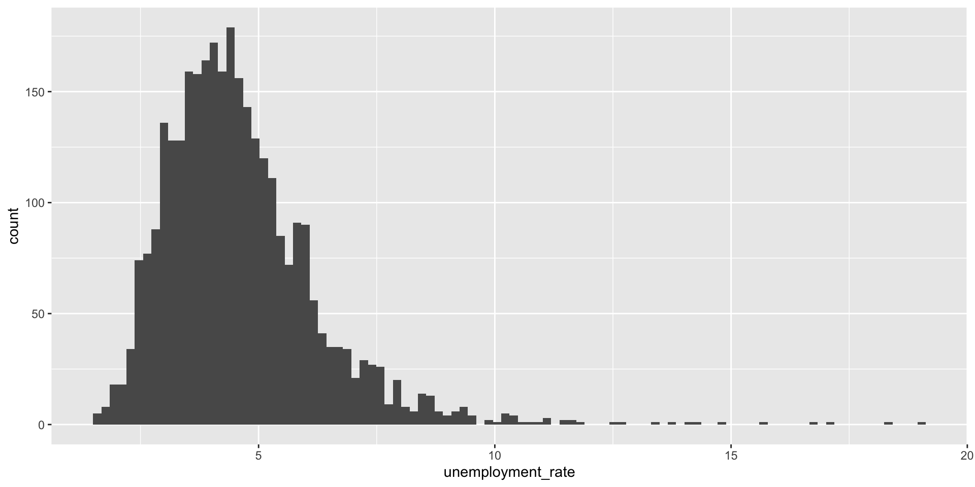
This distribution is skewed to the right, with a long tail to the right
Positive Skew
Or right-skewed
- Most values cluster on the left
- Some high values pull the mean up
- The mean is greater than the median
Mean
The mean is the sum of the terms divided by the number of terms.
Here’s the formula for the sample (the observations) mean:
\(\bar{x} = \frac{x_1 + x_2 ... + x_n}{n}\)
where \(x_1, x_2, ..., x_n\) represent the observed values
Or:
\(\bar{x } = \frac{ \sum_{i=1}^n x_i}{n}\)
Median
The sample median is the middle value when data is arranged in order from lowest to highest.
For odd n:
- Order the data from smallest to largest
- Median = value in position \((n+1)/2\)
For even n:
- Order the data from smallest to largest
- Median = average of values in positions \(n/2\) and \((n/2)+1\)
Measures of Central Tendency
- Mean
- Median
- Mode
Mode
- value(s) that appears most frequently in the data
It’s the only measure of central tendency that can be used with categorical data.
A dataset can have:
- One mode (unimodal)
- Two modes (bimodal)
- More than two modes (multimodal)
- No mode (if all values occur exactly once)
Measures of Central Tendency
Variability – range
- simplest measure of variability
- the difference between the largest and smallest values
- sensitive to outliers (uses two values)
- nothing about how values are distributed between the min and max
Variability – variance
- average squared distances from observations to the mean
\(s^2 = \frac{\sum_{i=1}^n (x_i - \bar{x})^2}{n-1}\)
Why do we use the squared deviation in the calculation of variance?
- To get rid of negative values so that observations equally distant from the mean are weighed equally
- To weigh larger deviations more heavily
Variability – standard deviation
- square root of the variance
- interpreted as the average distance of each data point from sample mean
- the degree of dispersion of the data points relative to its mean
\(s = \sqrt{s^2}\)
Or:
\(s = \sqrt{ \frac{\sum_{i=1}^n (x_i - \bar{x})^2}{n-1}}\)
Variability – standard deviation
- square root of the variance
- interpreted as the average distance of each data point from sample mean
- the degree of dispersion of the data points relative to its mean
Interquartile Range – IQR
- quartiles are the partitioned values that divide the values into 4 equal parts (3 quartiles)
- IQR is difference between the third and the first quartile So, there are
- the first quartile (or 25th percentile) is denoted by \(Q1\) and known as the lower quartile
- the second quartile (or 50th percentile) is denoted by \(Q2\) and known as the median
- the third quartile (or 75th percentile) is denoted by \(Q3\) and known as the upper quartile
Interquartile Range – IQR
- the interquartile range is equal to the upper quartile minus lower quartile
- between \(Q1\) and \(Q2\) is the middle 50% of the data
\(IQR = Q3 - Q1\)
Box plot
- the box represents the middle 50% of the data
- the thick line in the middle is the median
- top box line is \(Q3\)
- bottom box line is \(Q1\)
- whiskers:
- max upper whisker reach = \(Q3 + 1.5 * IQR\)
- max upper whisker reach = \(Q1 - 1.5 * IQR\)
Box plot
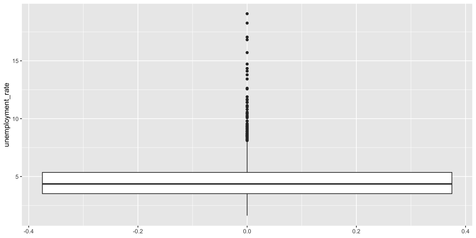
Outliers
- potential outliers are shown in the box plot as dots
- an outlier is an observation that:
- is beyond the maximun reach of the whiskers
- appears extreme, relative to the rest of the data