# load packages
library(tidyverse)

# read data in
water_data <- read_csv("data/water_insecurity_2023.csv")Case Study 1 – getting started with R
Let’s practice what you have learned so far, which is the following:
- Create a new R script
- Load the packages we need – for now we only need
tidyverse - Read the data in and give it a name
- Summarize the data by calculating the mean of the numeric variables
- Create a scatter plot of two numeric variables
The Data
We will be working with data on water insecurity, more specifically the 2023 data
Load and inspect the data
After you created a new R script – I named my script water_insecurity.R, we need to load tidyverse and read the data in. I saved the .csv file in my data folder in my project.
Let’s inspect the data to understand what variables we are dealing with.
We can run glimpse() on the data to get information about how many observations and what columns we have in our data:
water_data |>
  glimpse()
Rows: 854
Columns: 7
$ geoid <chr> "01003", "01069", "06037", "06087", "06097", …
$ name <chr> "Baldwin County, Alabama", "Houston County, A…
$ year <dbl> 2023, 2023, 2023, 2023, 2023, 2023, 2023, 202…
$ geometry <chr> "list(list(c(765297.99052762, 765703.76567671…
$ total_pop <dbl> 253507, 108462, 9663345, 261547, 481812, 1155…
$ plumbing <dbl> 271, 30, 5248, 187, 308, 517, 4, 198, 1269, 8…
$ percent_lacking_plumbing <dbl> 0.106900401, 0.027659457, 0.054308317, 0.0714…When we see <chr> next to values that means R read that column values as character (or string) – meaning, it is a categorical variable. When you see <dbl> that means the colum values are double (or float) – meaning, it is a continuous numeric variable.
Descriptive question
Let’s answer this question:
What’s the average percentage of homes lacking plumbing in the US?
water_data |>
  summarize(mean_lacking_pumbling = mean(percent_lacking_plumbing))
Oh oh – we got a NA for the mean (Not Available). That means there are missing values in the data. We can ignore the missing values by setting the na.rm parameter (remove NAs) to TRUE:
water_data |>
  summarize(mean_lacking_pumbling = mean(percent_lacking_plumbing, na.rm = TRUE))
The average percentage of American homes lacking pumbling is around 10.2%
Plotting numeric variables
Let’s create a scatter plot of The total owner occupied households lacking plumbing facilities and The total population – the plumbing and total_pop variables.
water_data |>
  ggplot(aes(y = plumbing, x = total_pop)) +
  geom_point()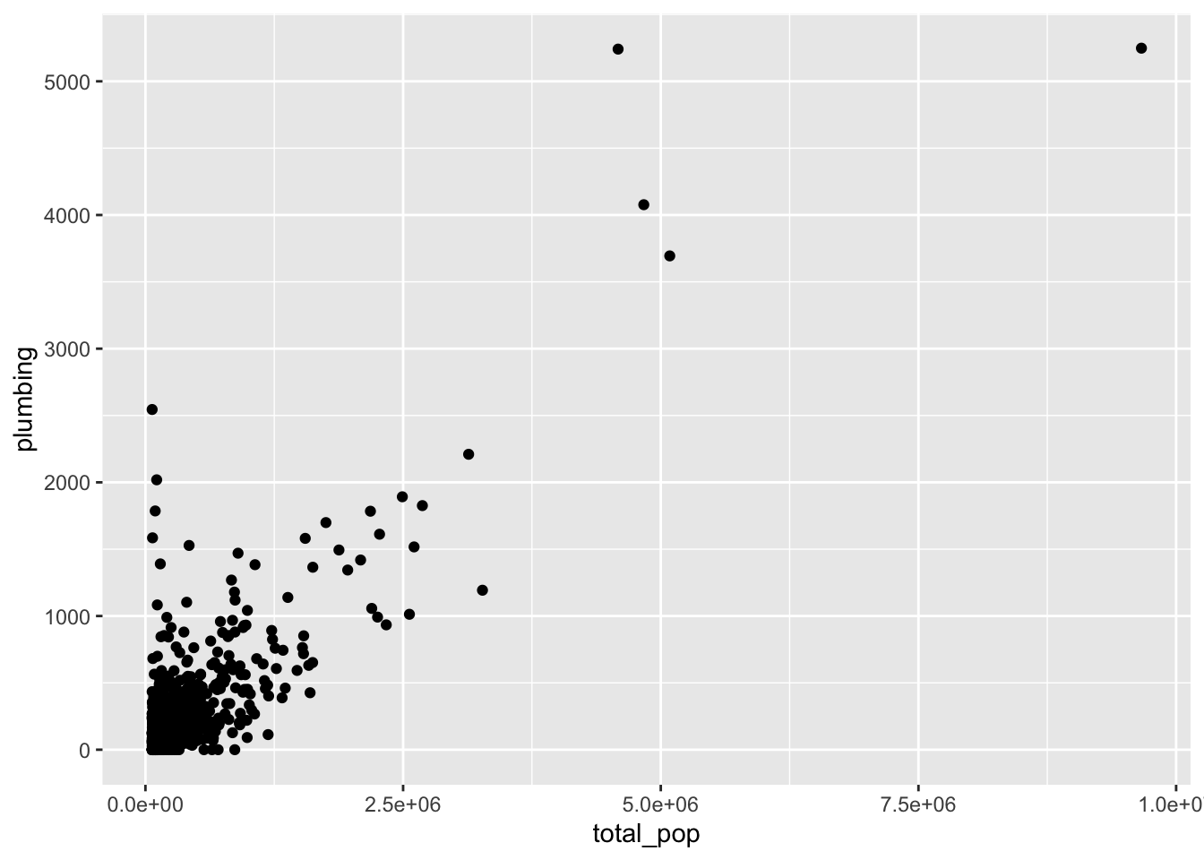
Comparative questions
We can try to answer the following question with these data:
What is the average percentage of homes lacking pumbling across different US states?
Note that we do not have a state variable in our data – we have a name column that contains a county name, a comma, and the state name.
We can create a separate state name column by using the separate() function:
water_data |>
  separate(name, into = c("county", "state"), sep = ", ")
That seemed to have worked – but my water_data hasn’t changed. We need to overwrite the data, by assigning the results of our separate to our data frame name, by adding water_data <- before our code block:
water_data <- water_data |>
  separate(name, into = c("county", "state"), sep = ", ")
We can now summarize the mean of percent_lacking_plumbing by our newly created column state (remember to remove NAs).
For this, we will add group_by(state) before our summarize call:
water_data |>
  group_by(state) |>
  summarize(mean_lacking_pumbling = mean(percent_lacking_plumbing, na.rm = TRUE))
Let’s sort our results, so we do comparisons more easily. We will add arrange(mean_lacking_pumbling) to the end of our code block:
water_data |>
  group_by(state) |>
  summarize(mean_lacking_pumbling = mean(percent_lacking_plumbing, na.rm = TRUE)) |>
  arrange(mean_lacking_pumbling)
Plotting results
That is a quite a wide range of percentages.
Let’s plot our results.
To do so, we will create a new data frame with our results. I wil name this new data frame by_state:
by_state <- water_data |>
  group_by(state) |>
  summarize(mean_lacking_pumbling = mean(percent_lacking_plumbing, na.rm = TRUE)) |>
  arrange(mean_lacking_pumbling)
Let’s create a column plot, with state on the y axis and mean_lacking_pumbling on the x axis:
by_state |>
  ggplot(aes(y = state, x = mean_lacking_pumbling))
We need a geometrics, in this case we will use geom_col():
by_state |>
  ggplot(aes(y = state, x = mean_lacking_pumbling)) +
  geom_col()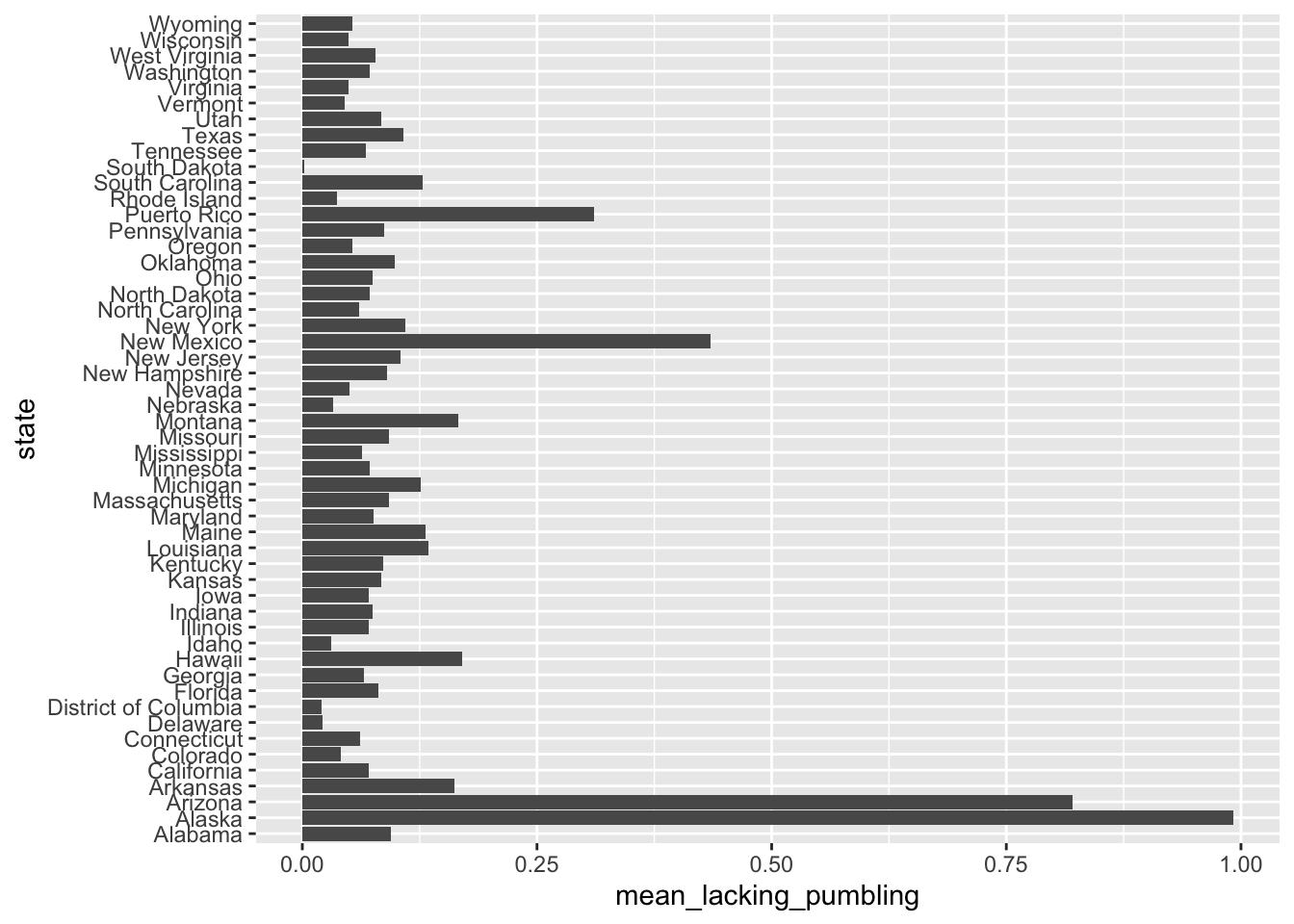
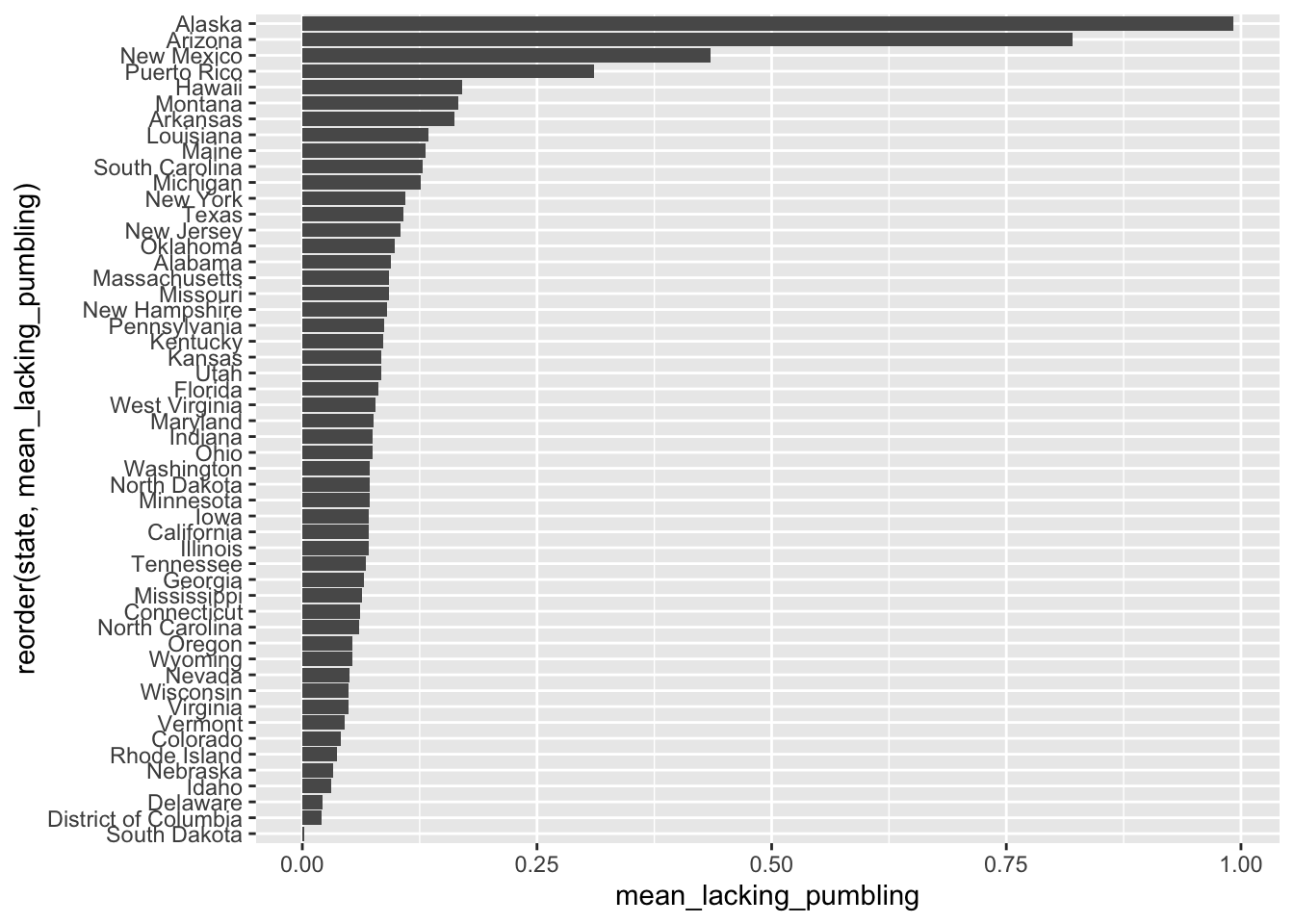
The variable state is a categorical variable, nominal (meaning, there’s no order to it) – let’s order state by our numeric variable so it’s easier the plot is more meaningful:
by_state |>
  ggplot(aes(y = reorder(state, mean_lacking_pumbling),
             x = mean_lacking_pumbling)) +
  geom_col()