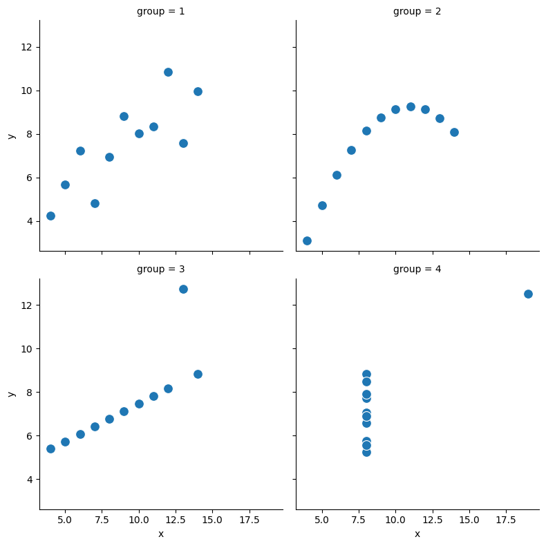
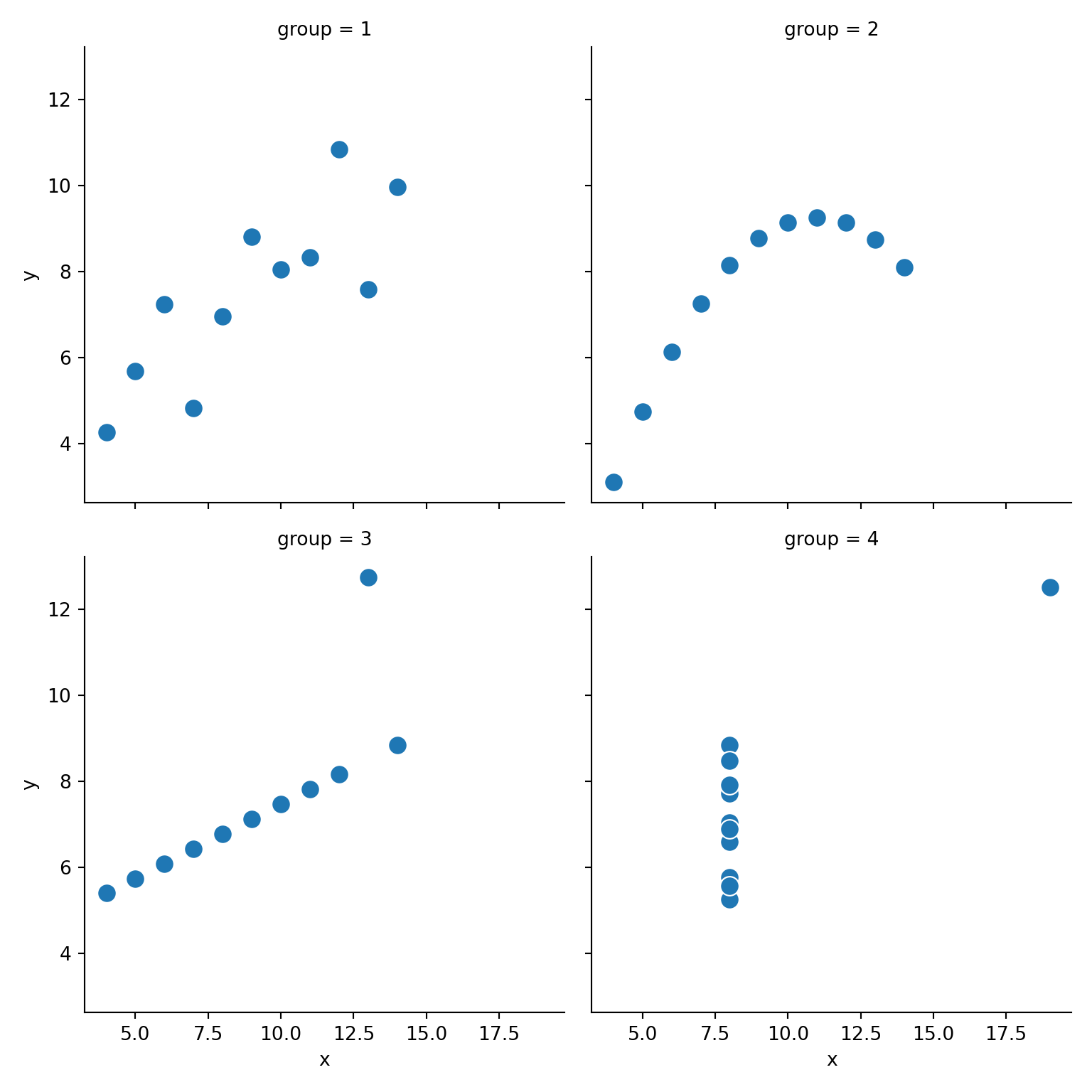
   experiment  group   x      y
0           A      1  10   8.04
1           A      2  10   9.14
2           A      3  10   7.46
3           A      4   8   6.58
4           B      1   8   6.95
5           B      2   8   8.14
6           B      3   8   6.77
7           B      4   8   5.76
8           C      1  13   7.58
9           C      2  13   8.74
10          C      3  13  12.74
11          C      4   8   7.71
12          D      1   9   8.81
13          D      2   9   8.77
14          D      3   9   7.11
15          D      4   8   8.84
16          E      1  11   8.33
17          E      2  11   9.26
18          E      3  11   7.81
19          E      4   8   8.47
20          F      1  14   9.96
21          F      2  14   8.10
22          F      3  14   8.84
23          F      4   8   7.04
24          G      1   6   7.24
25          G      2   6   6.13
26          G      3   6   6.08
27          G      4   8   5.25
28          H      1   4   4.26
29          H      2   4   3.10
30          H      3   4   5.39
31          H      4  19  12.50
32          I      1  12  10.84
33          I      2  12   9.13
34          I      3  12   8.15
35          I      4   8   5.56
36          J      1   7   4.82
37          J      2   7   7.26
38          J      3   7   6.42
39          J      4   8   7.91
40          K      1   5   5.68
41          K      2   5   4.74
42          K      3   5   5.73
43 K 4 8 6.89Principles of Data Visualization
Plots per group
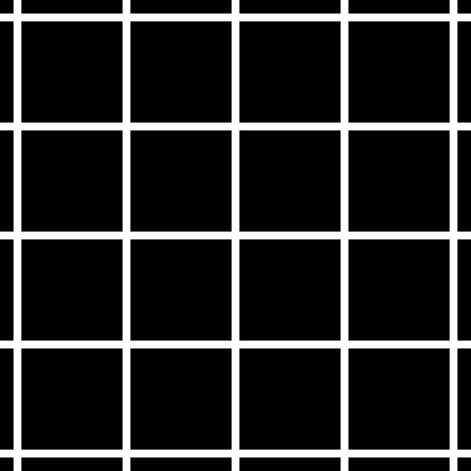
Herman grid effect
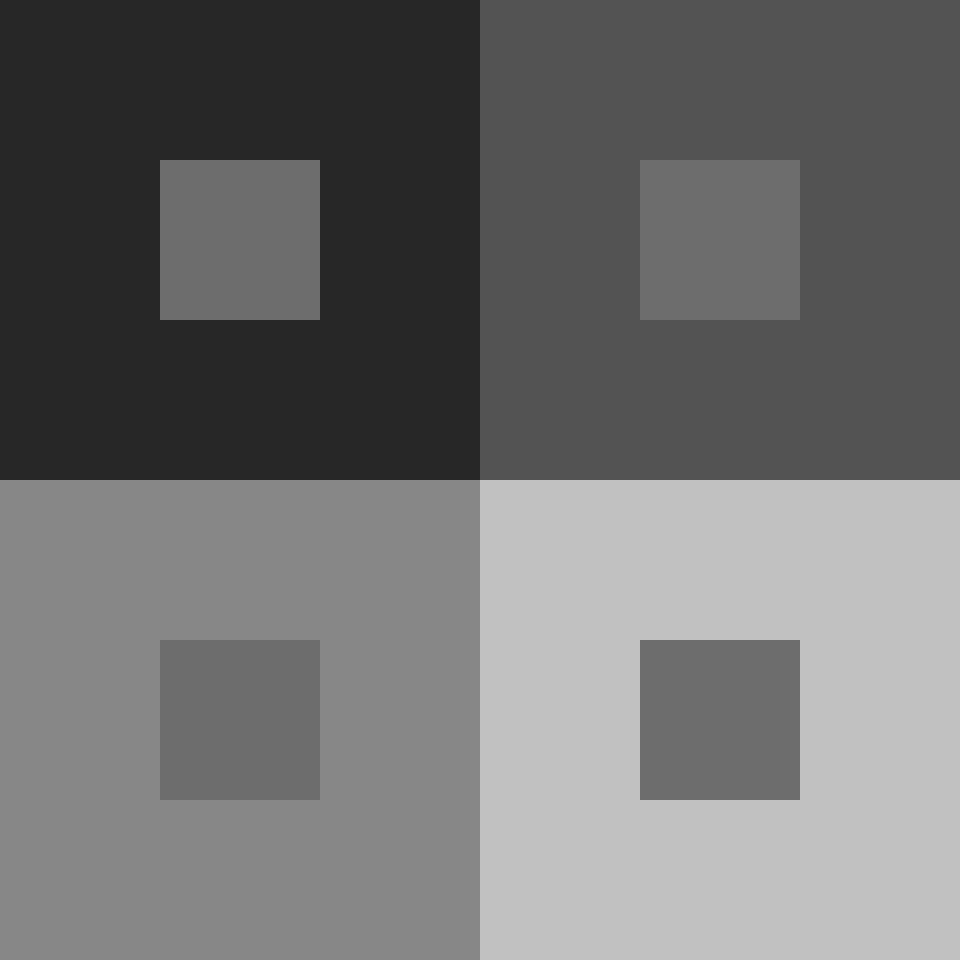
Contrast
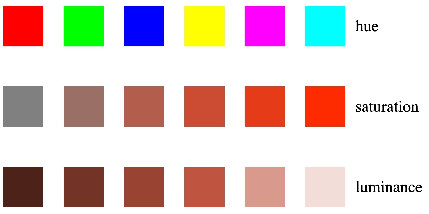
HSL
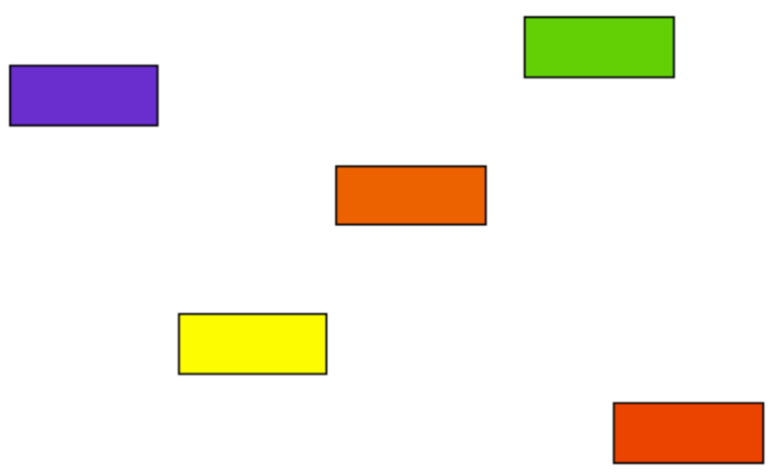
Order these colors
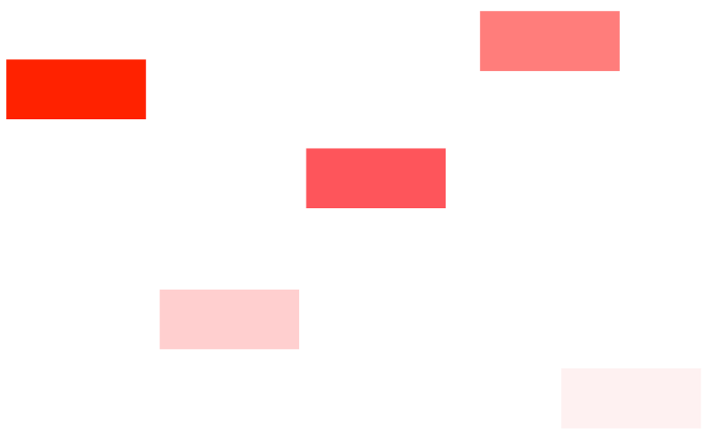
Order these colors
Color
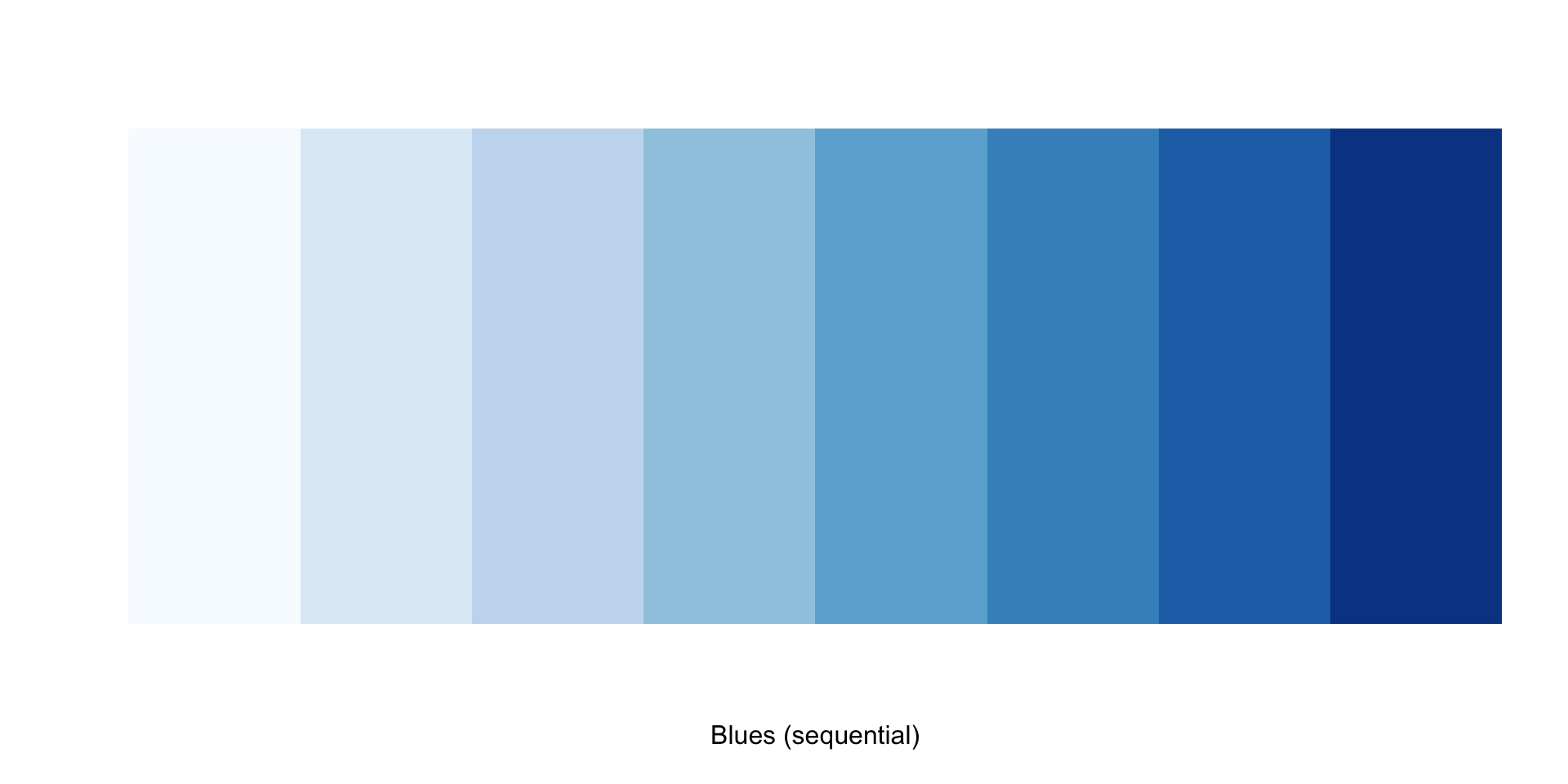
- Gradients should be used as sequential scales from low to high to represent numeric continuous/ordered variables (e.g., population size). Light colors should represent low values, and dark colors high values.
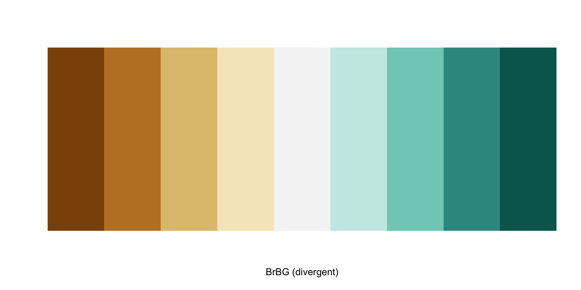
Color
- Diverging scales should be used where there is a neutral midpoint and then there is variance in ether direction from that neutral point (e.g., temperatures can be positive and negative).
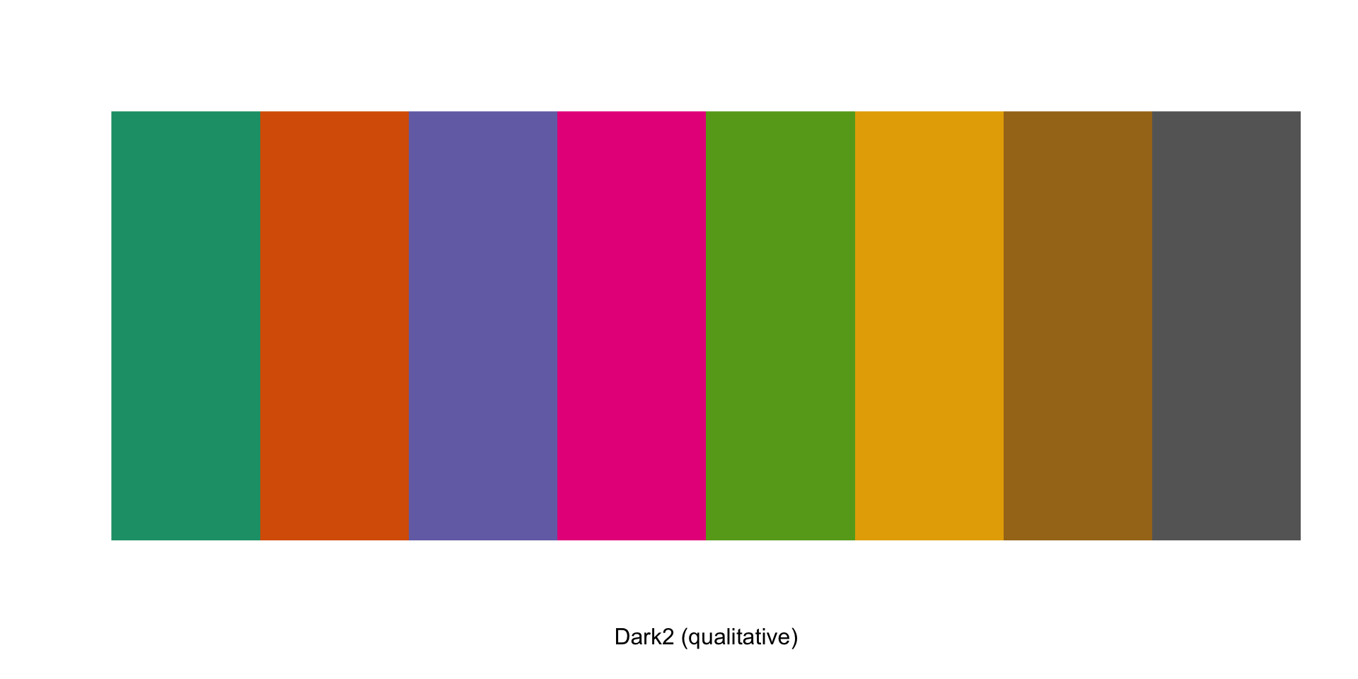
Color
- Qualitative palettes where each color has the same valence (i.e., no color dominates the other) should be used for unordered categorical variables (e.g., political parties, countries). Different colors in the palette should not imply differences in magnitude.
Visual Search and Pop-out Effect
Try to find the type B
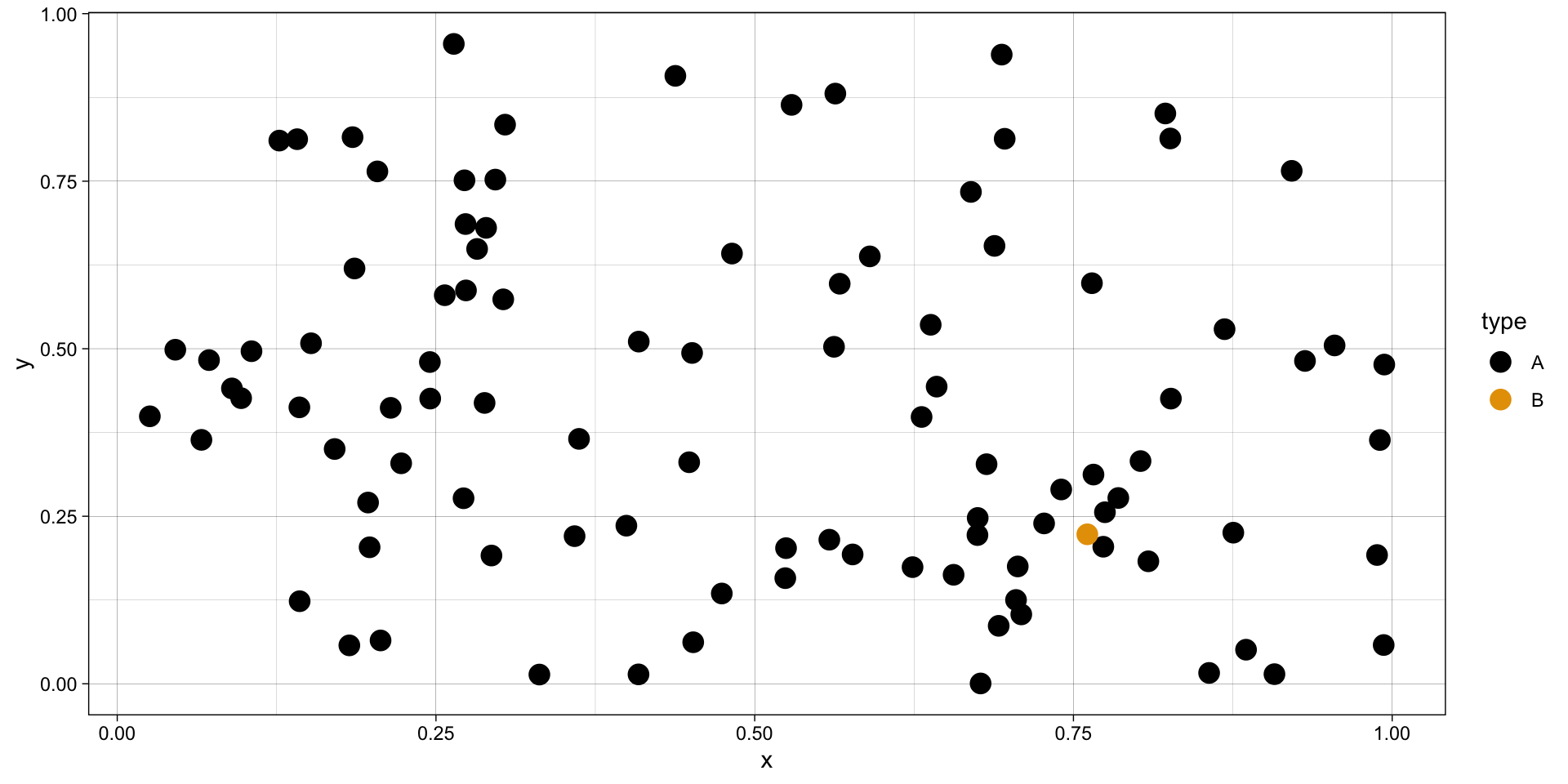
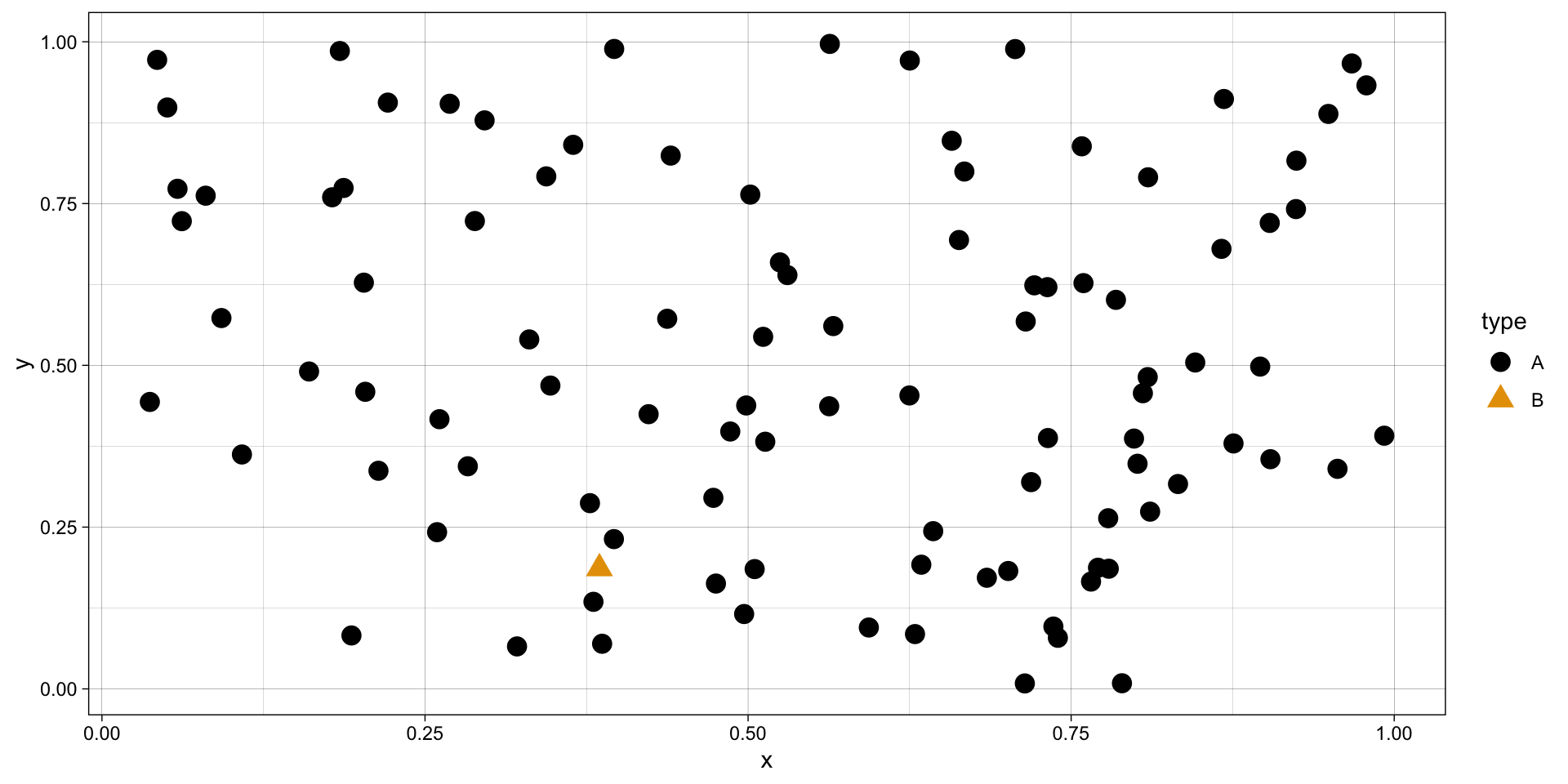
Visual Search and Pop-out Effect
Try to find the type B
Visual Search and Pop-out Effect
Try to find the type B
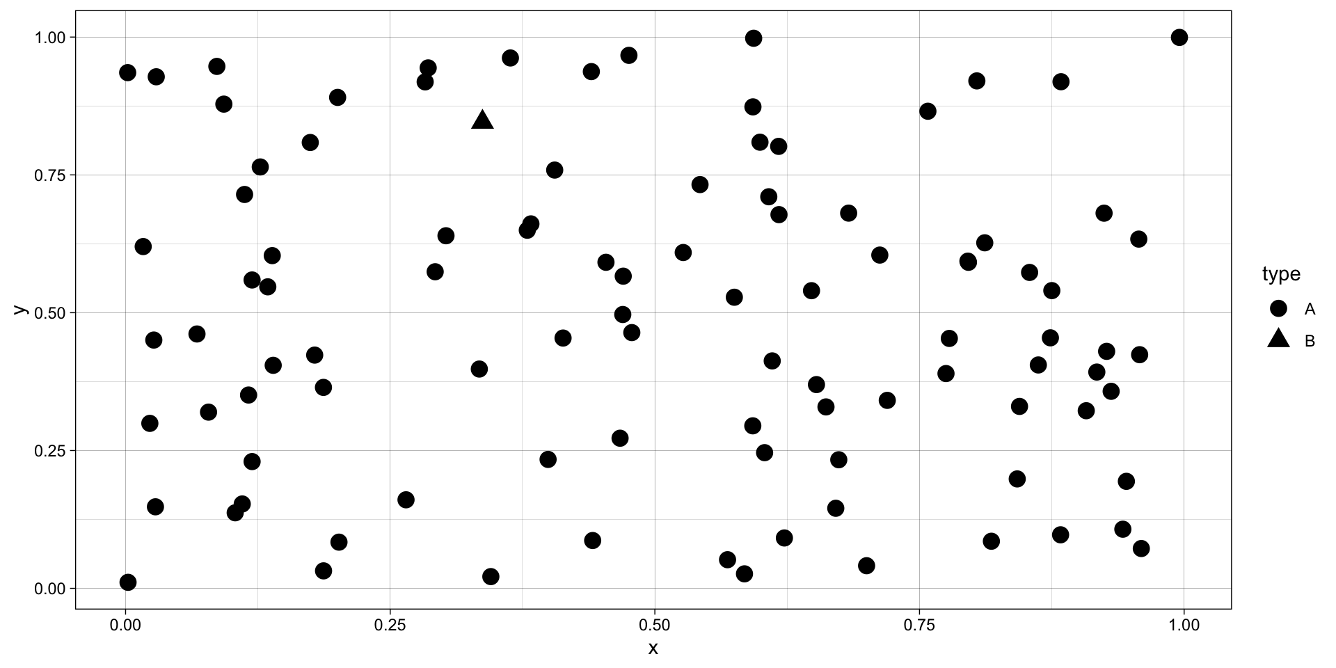
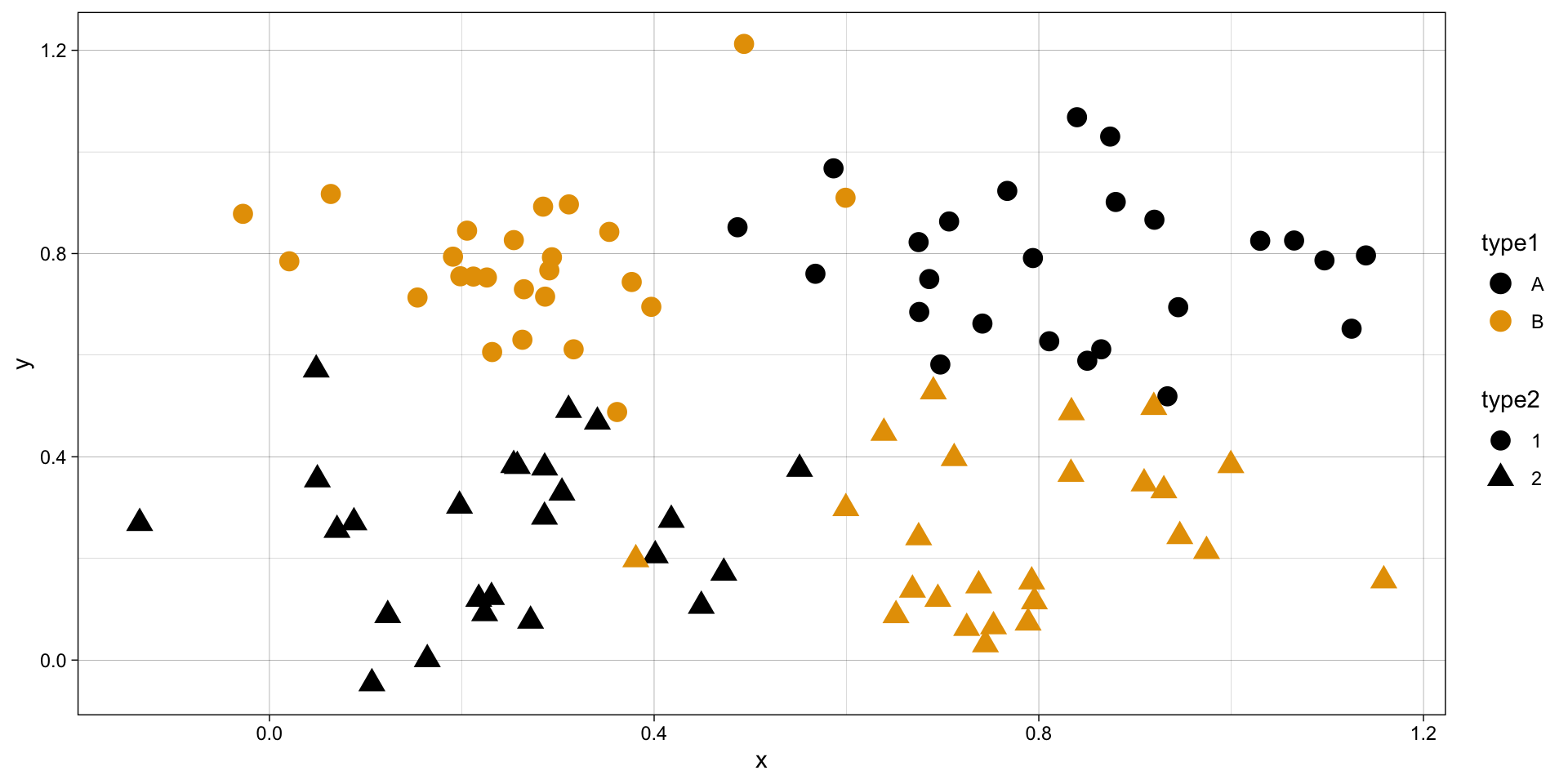
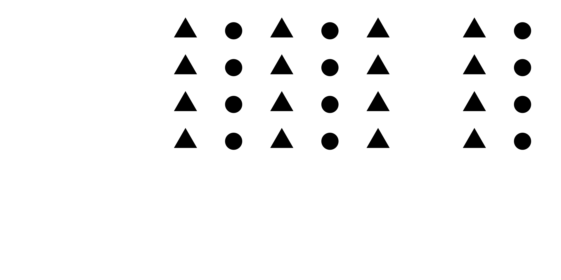
Color and shape – overtaxing
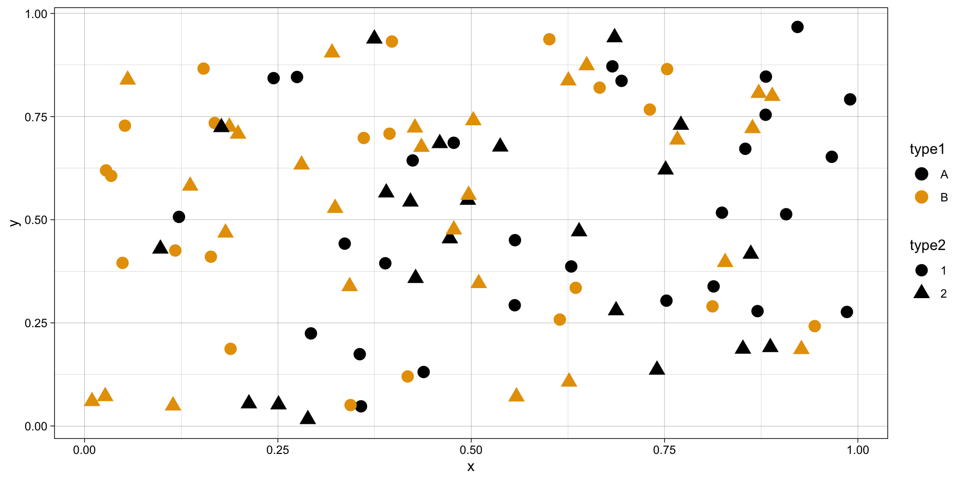
Color and shape – overtaxing
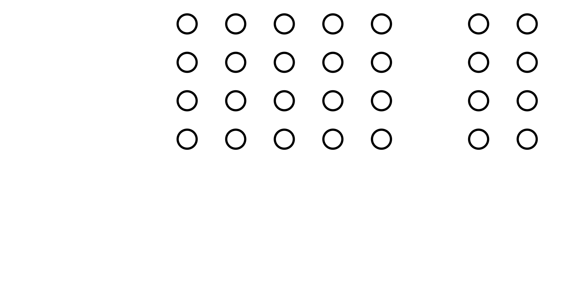
Gestalt Principles
Visual elements are perceived as being related to each other when these elements are close to each other – i.e., Proximity principle:
Gestalt Principles
Visual elements are perceived as being related to each other when these elements are similar in shape, color and size – i.e., Similarity principle:
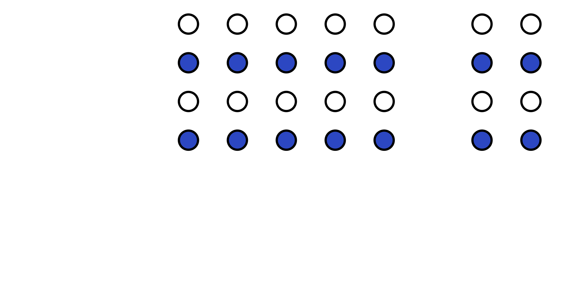
Gestalt Principles
Visual elements are perceived as being related to each other when these elements are similar in shape, color and size – i.e., Similarity principle:
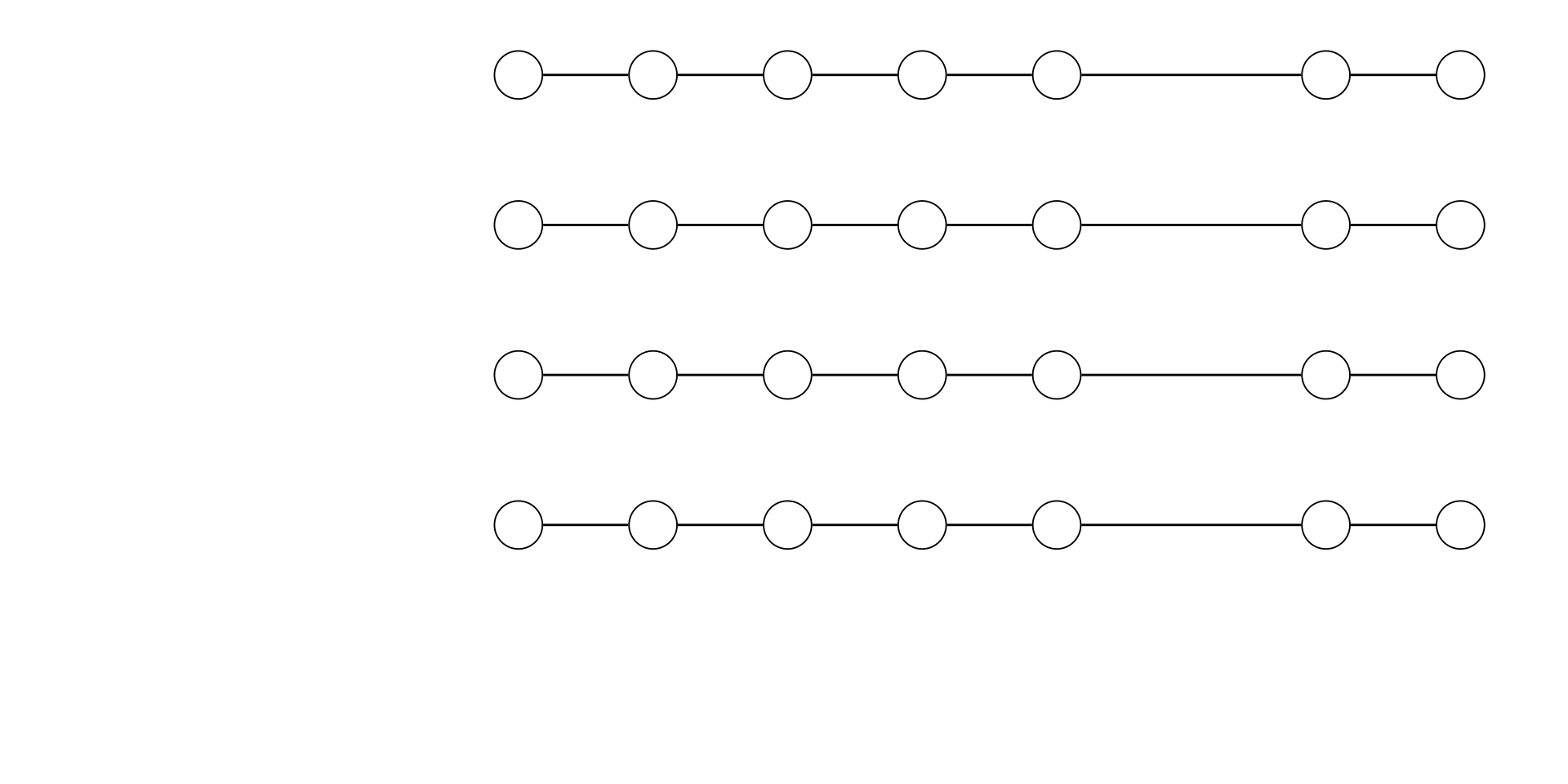
Gestalt Principles
Visual elements are perceived as being related to each other when these elements are visually tied – i.e., Connection principle:
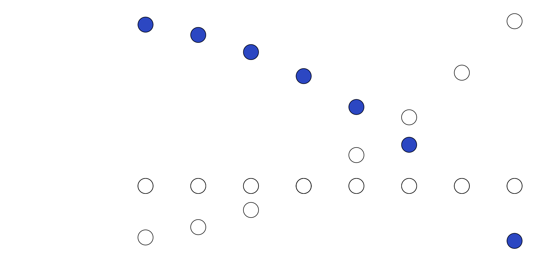
Gestalt Principles
Visual elements are perceived as being related to each other when these elements are perceived as being part paths, lines, curves, even when some elements are “hidden” – i.e., Continuity principle:
Gestalt Principles
- not complete; we construct the incomplete form into familiar shapes – i.e., Closure principle